Specialized Vocabulary — Film Photography from A to Z
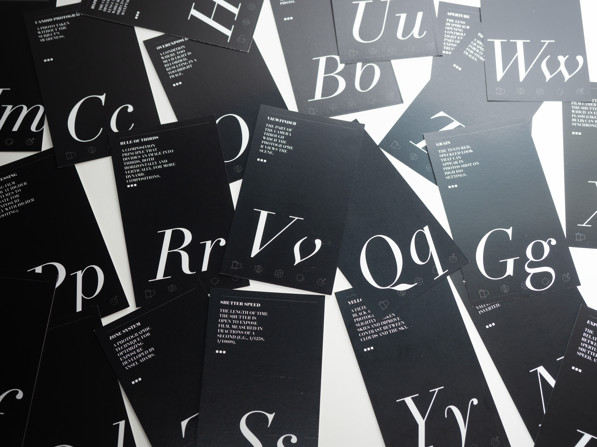
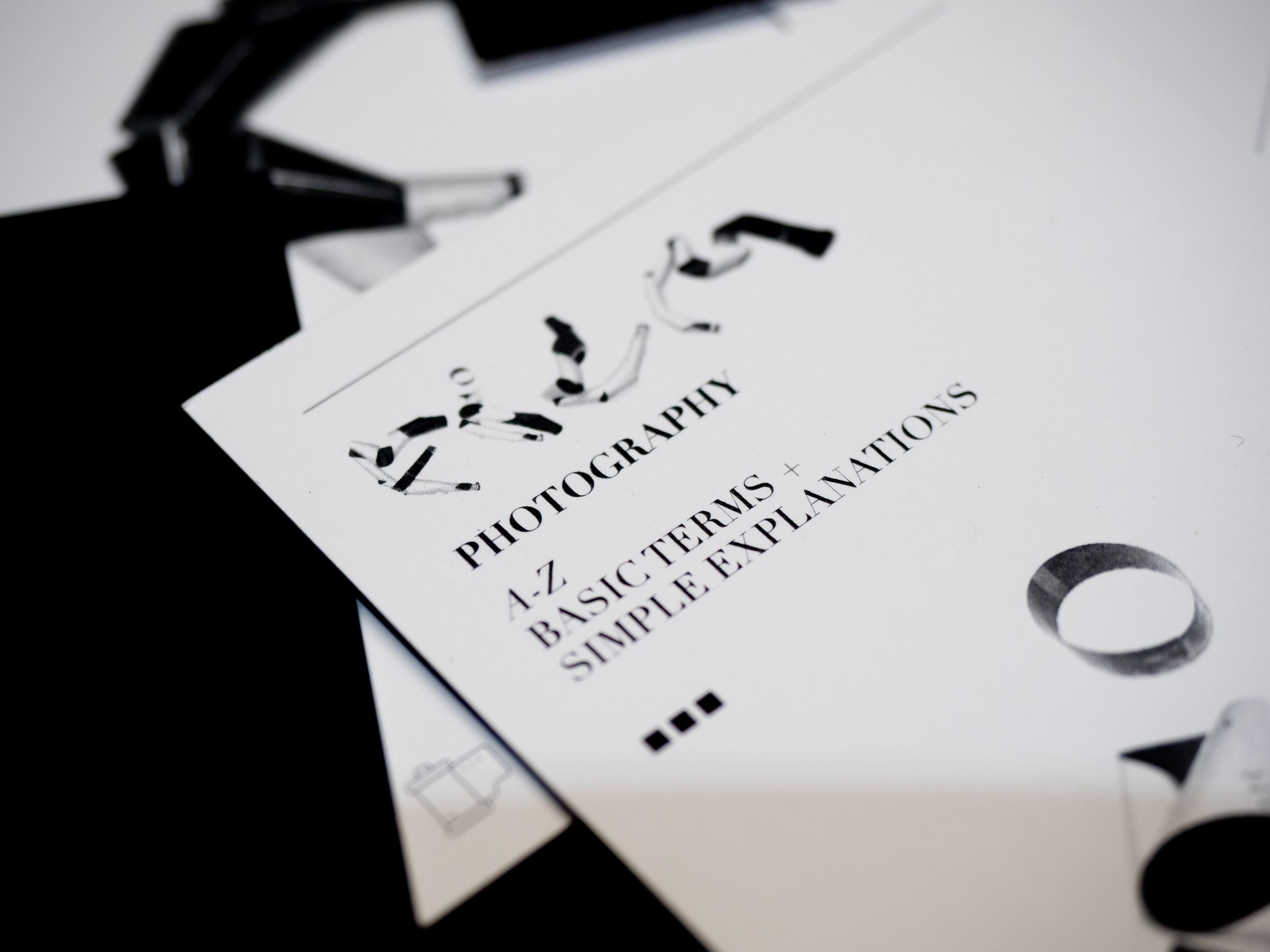
An editorial design project that translates the technical language of film photography into a structured visual system. This work explores how specialized vocabulary can be organized, clarified, and reinterpreted through typography and layout.
Role: Publication Designer
Deliverables: Editorial Design, Book Design, Typography System, Layout Design, Print Production, Publication Design
Tools: Adobe InDesign, Photoshop, Illustrator
Film photography relies on a dense and often inaccessible vocabulary: aperture, grain, reciprocity failure, developer, and fixer. For beginners, this language can act as a barrier rather than a tool.
This project responds to that challenge by reframing terminology as a design problem:
How can complex, technical language be made clear, engaging, and visually coherent?
Ideation
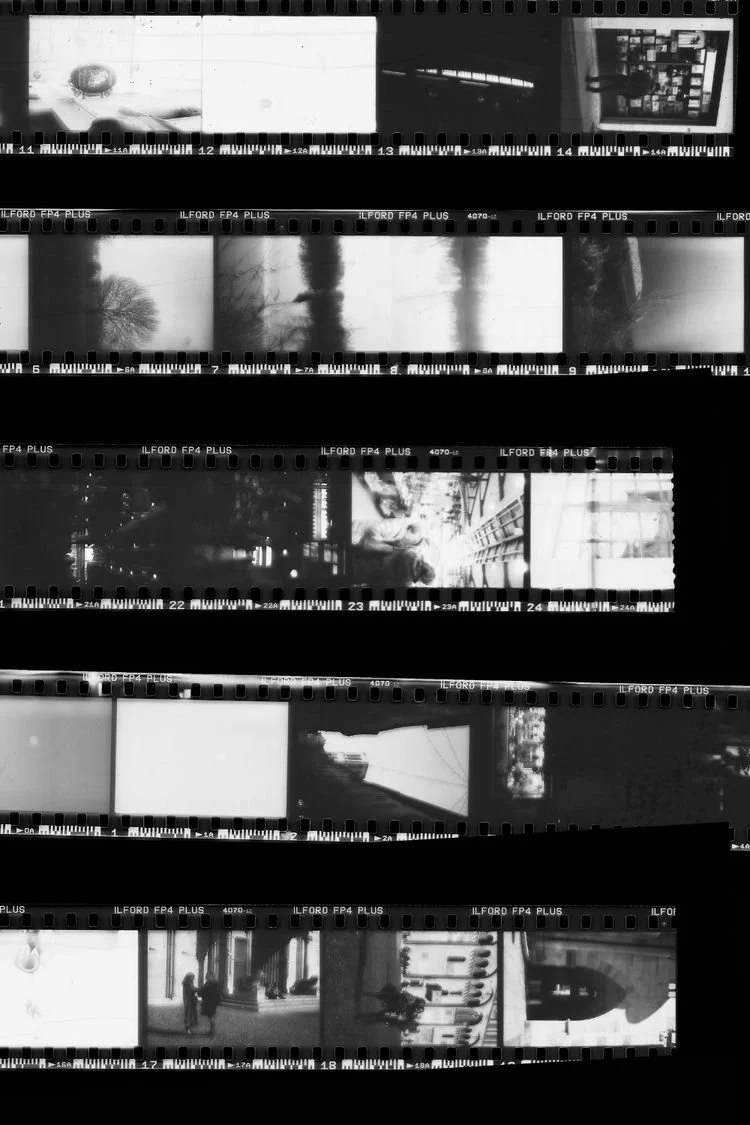
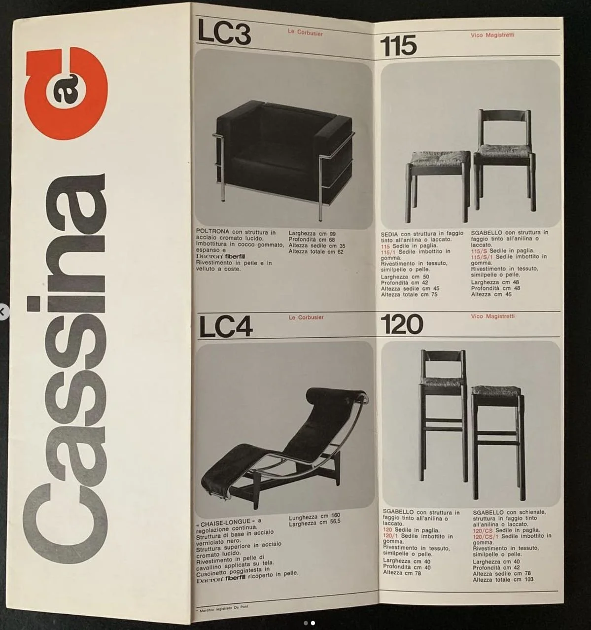
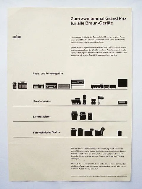
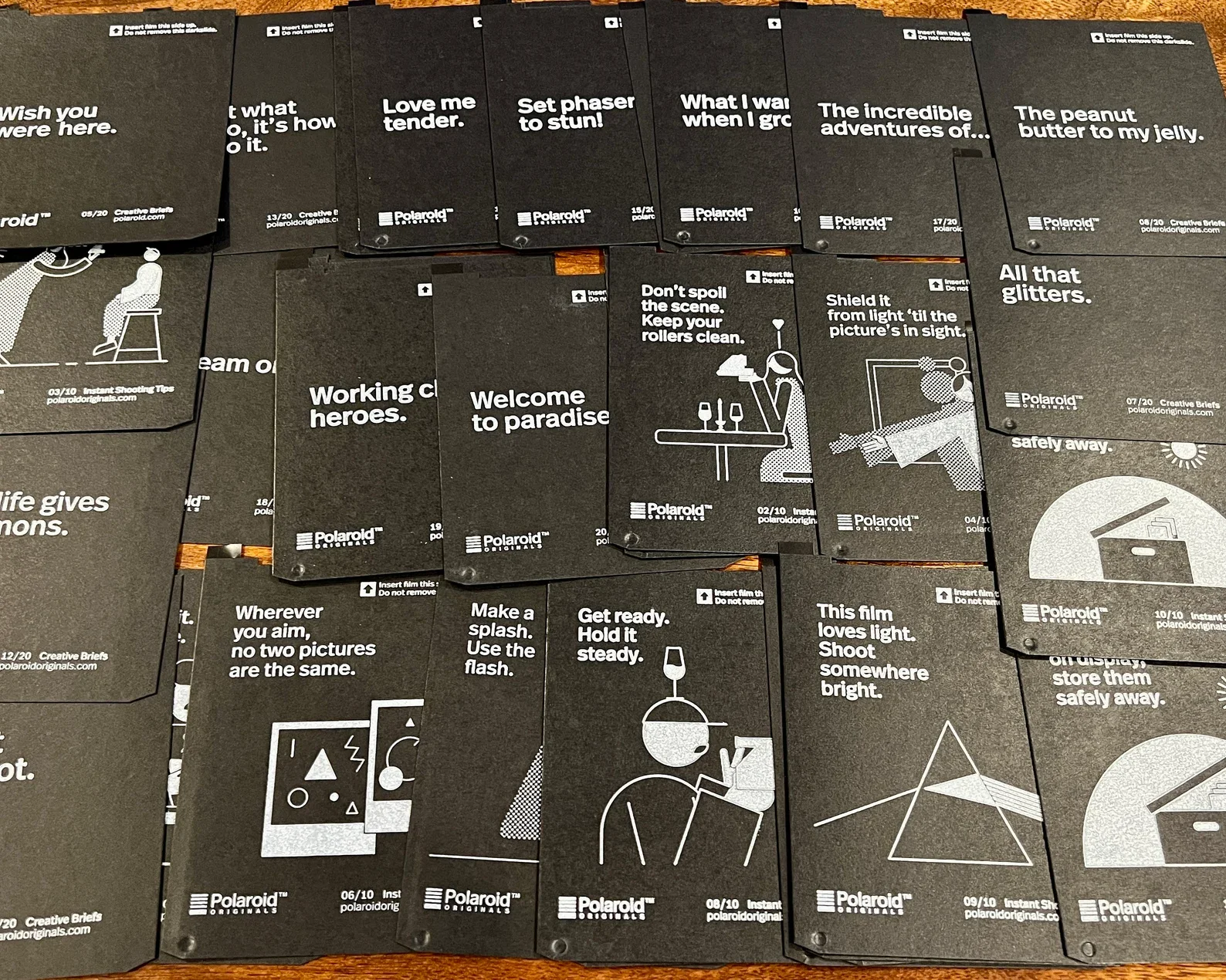
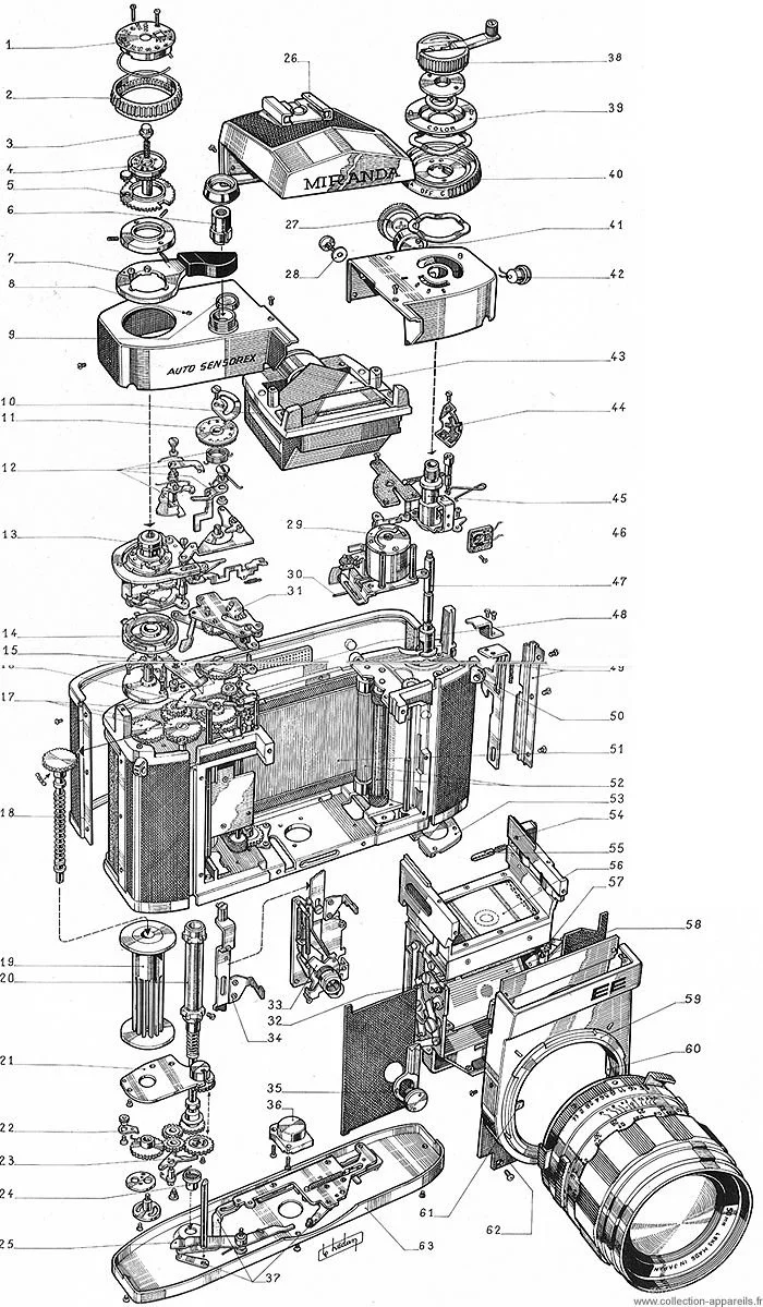
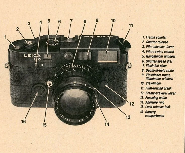
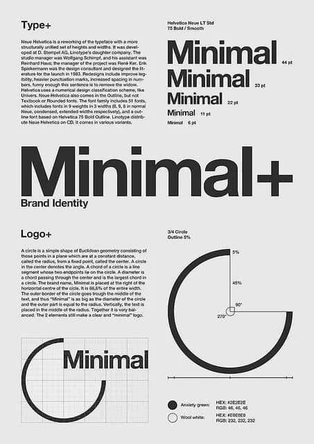
Objective
Turn the A–Z of film photography — the language most people never learn — into something you can actually see, read, and feel.
Design Approach
Type-driven, grid-built, kept clean — every page doing its part for one bigger system.
Process
Curate the terms, build the system, refine it until every page reads clean from A to Z.
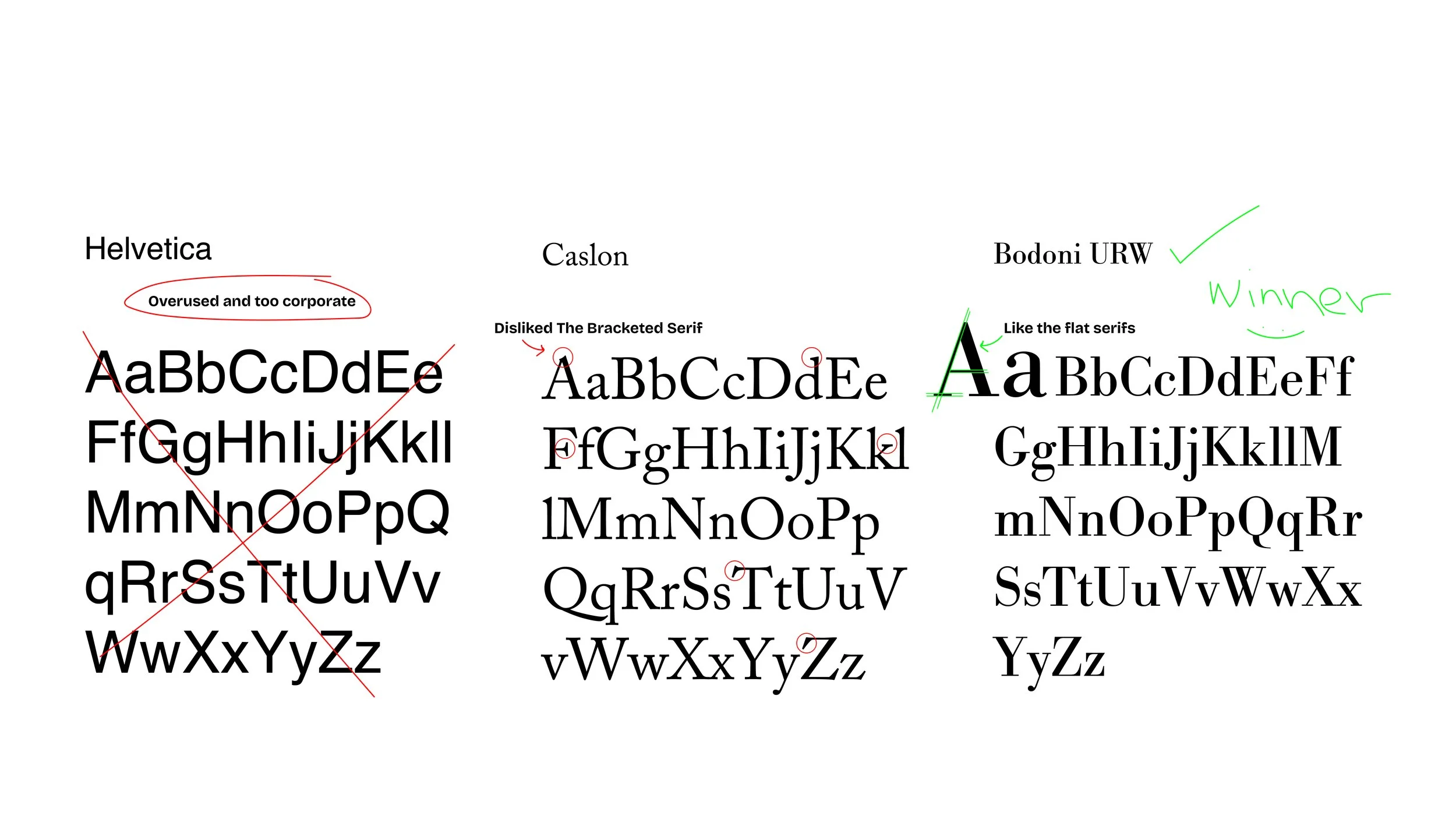
Specimen Comparison: Study 01-03
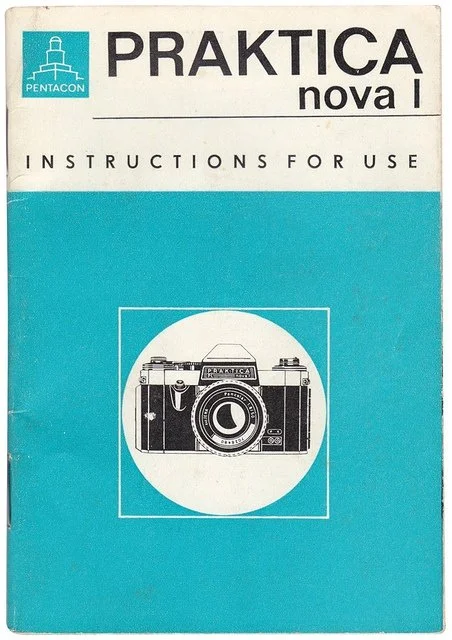
A vocabulary this precise needed a typeface as sharp as a lens — three tests in, this one focused.
-
Neo-Grotesque
-
High legibility; feels like a technical 1970s camera manual.
-
Felt too "corporate" and lacked the romanticism of film.
Helvetica
-
Old Style Serif
-
Traditional and academic; feels like a textbook.
-
The curves were too soft; it didn't have the "sharpness" of a focused lens.
Caslon
-
Didone / Modern
-
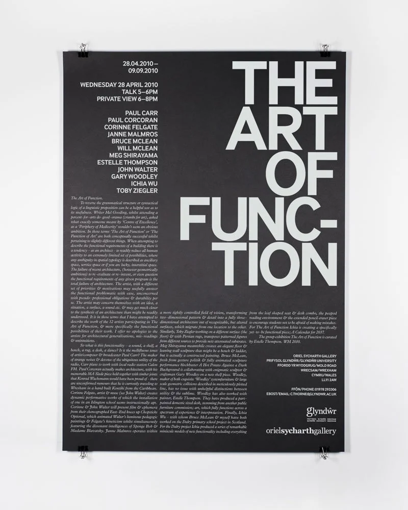
High contrast and vertical stress. It mirrors the mechanical precision and "Classic" era of photography.
-
The extreme contrast between thick and thin strokes reflects the play of light and shadow in film.
Bodoni (Winner)
The alphabet isn't just order here — it's the design, turning each term into a piece of one rhythmic, navigable system.
Destruction & The 120 Alphabet
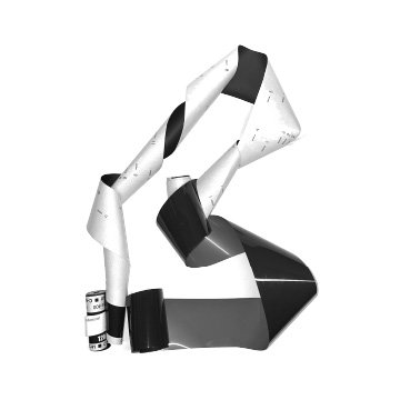
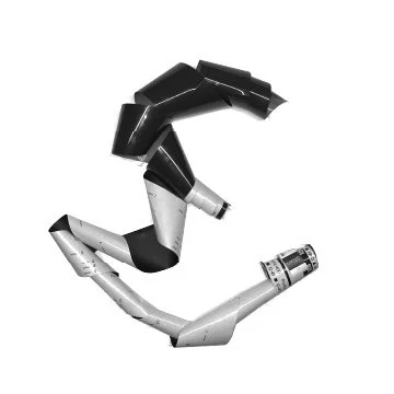
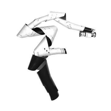
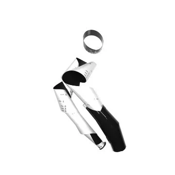
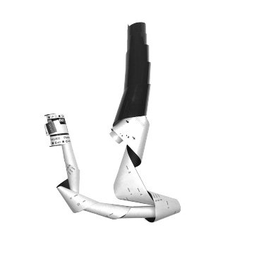
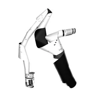
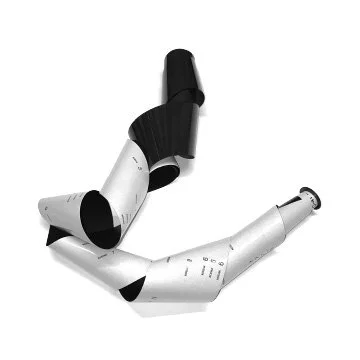
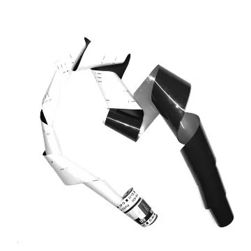
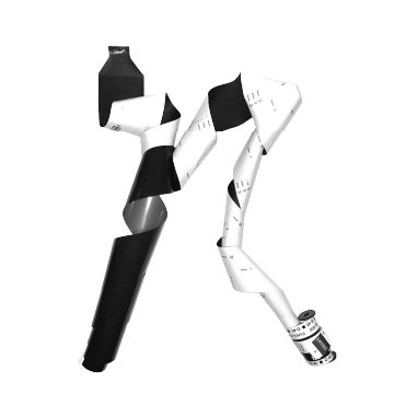
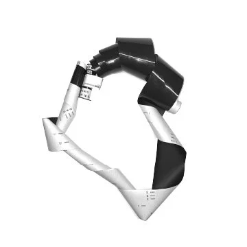
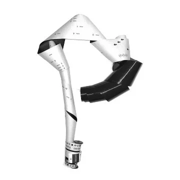
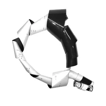
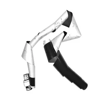
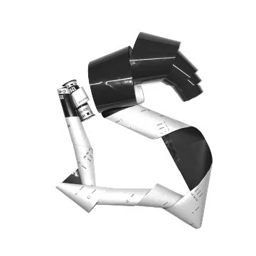
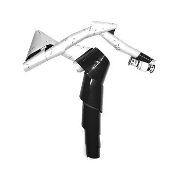
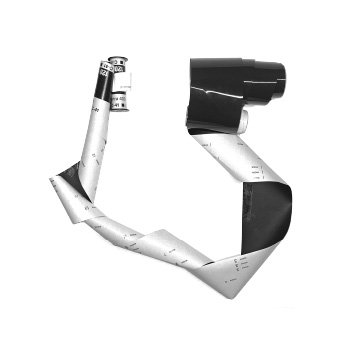
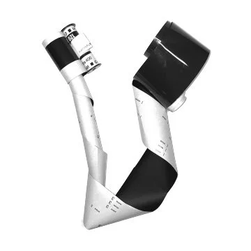
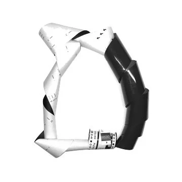
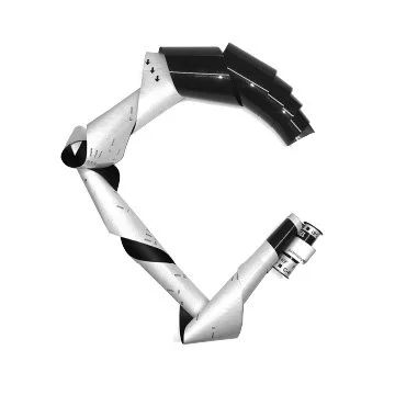
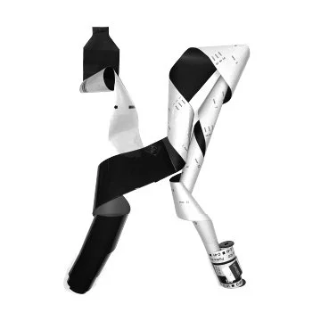
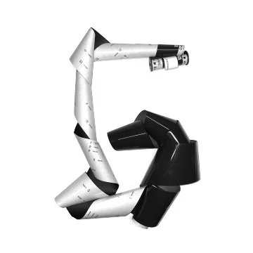
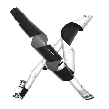
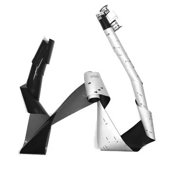
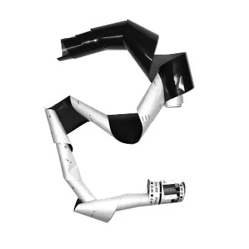
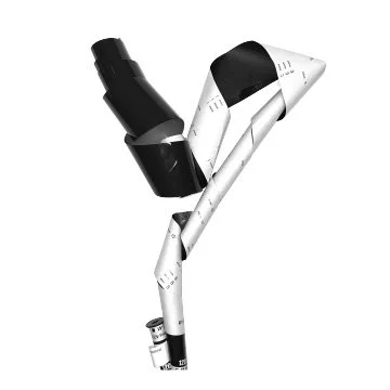
Every letter was born on real film — hand-distressed Ilford HP5 emulsion turned into an alphabet no digital filter could fake.
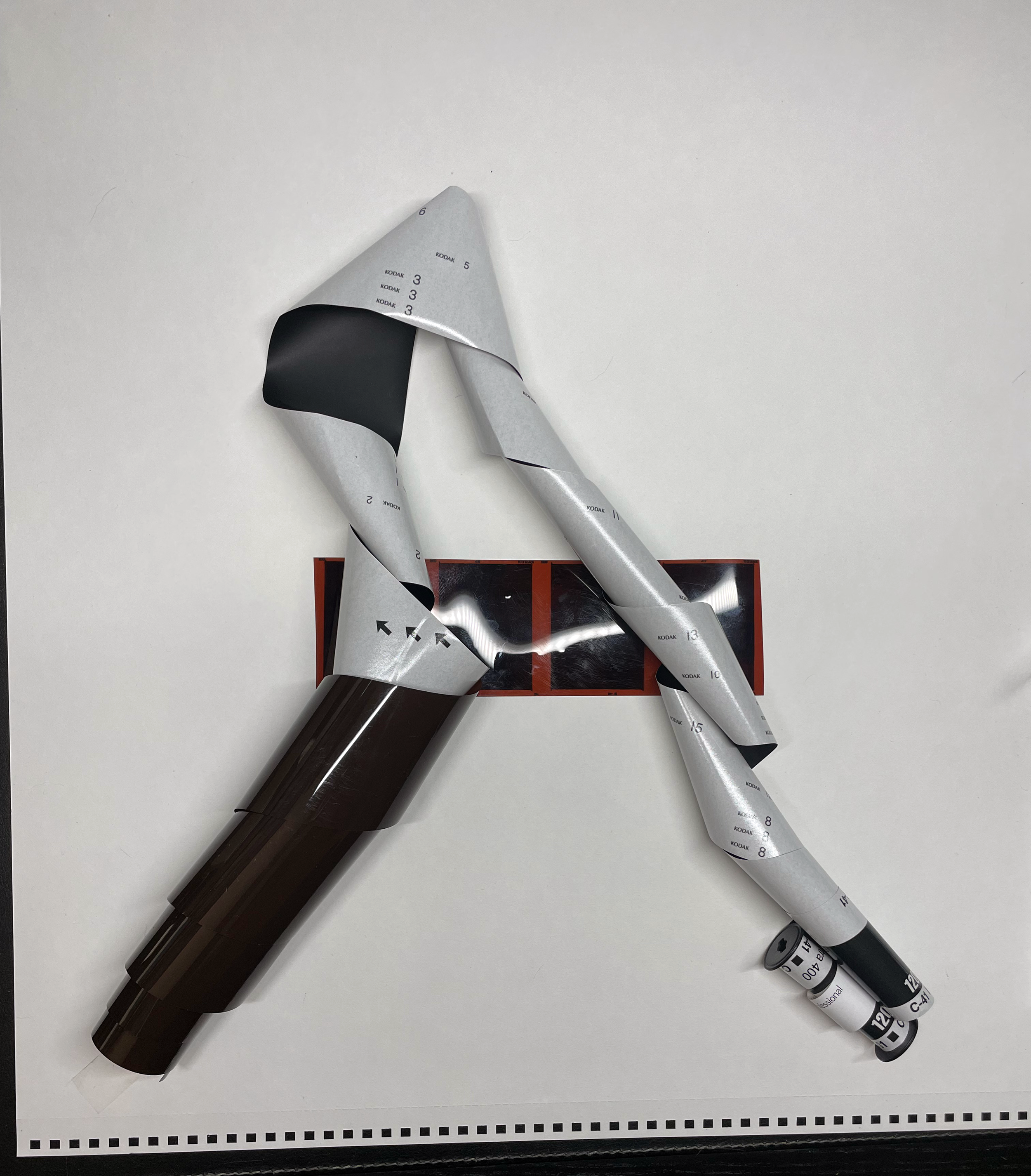
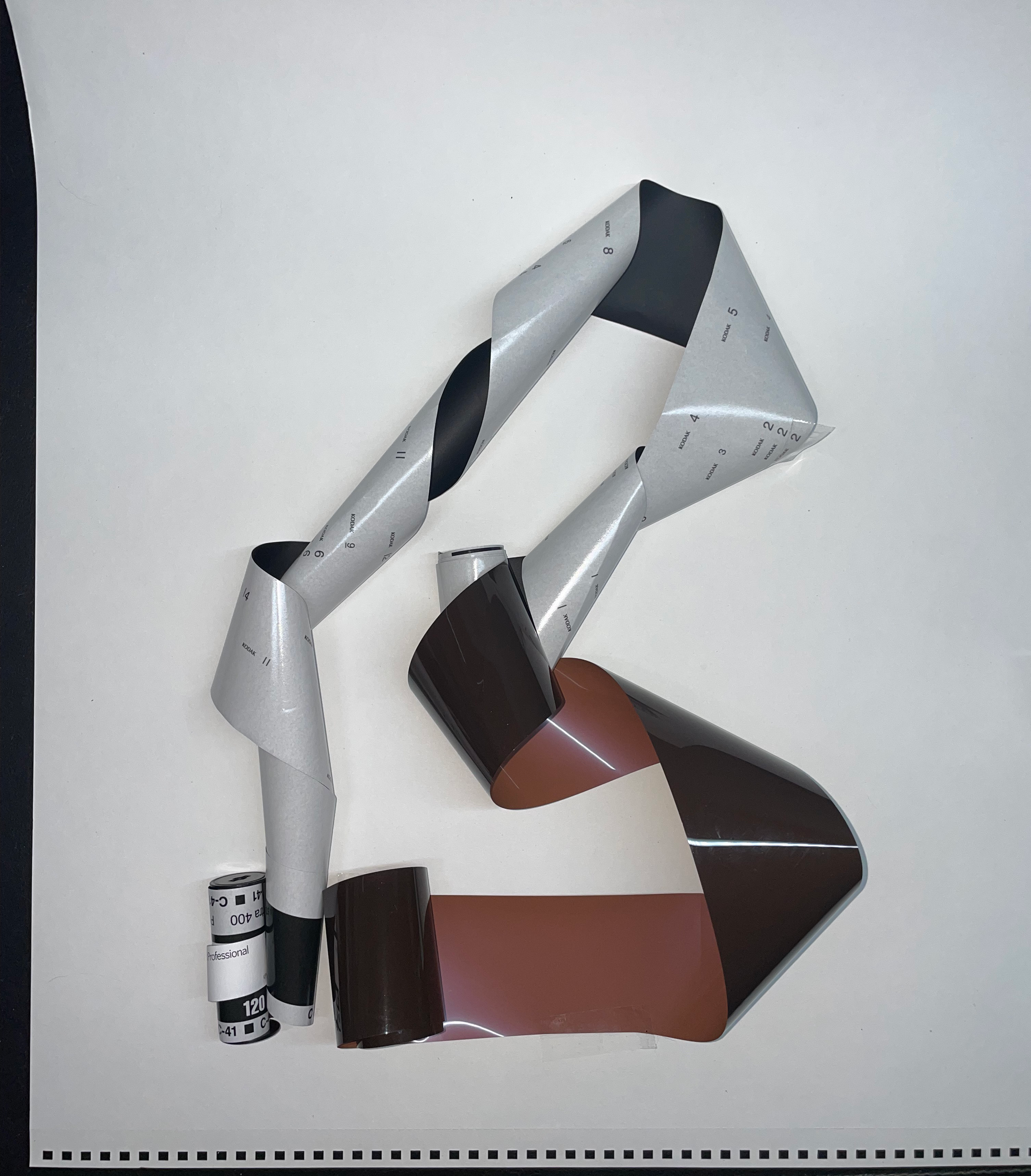
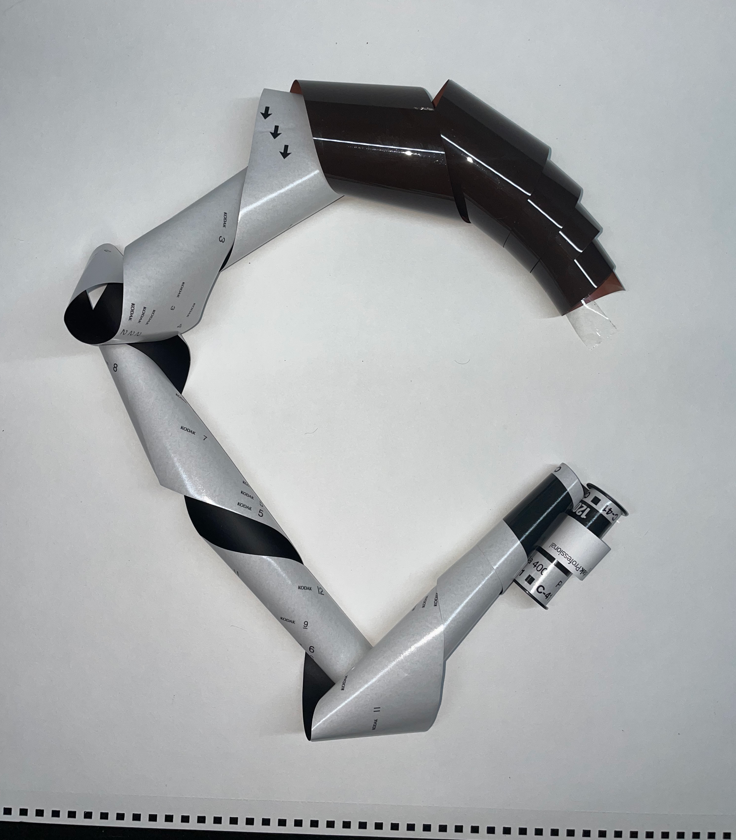
Work in Progress: Captured during the manual distressing phase, documenting the reaction of HP5 emulsion to physical interference.
Final A-Z Alphabet
Dieline & Packaging System
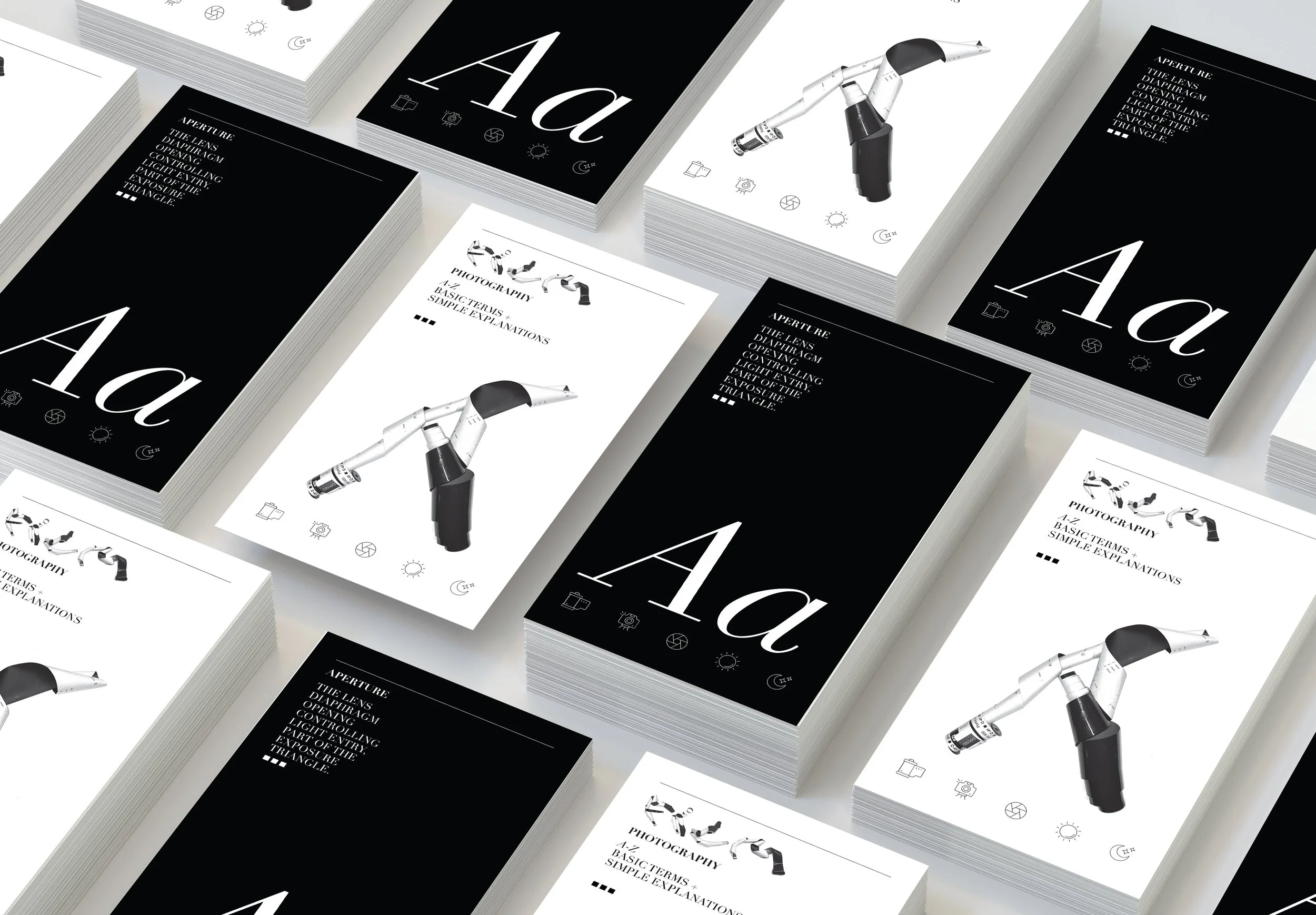
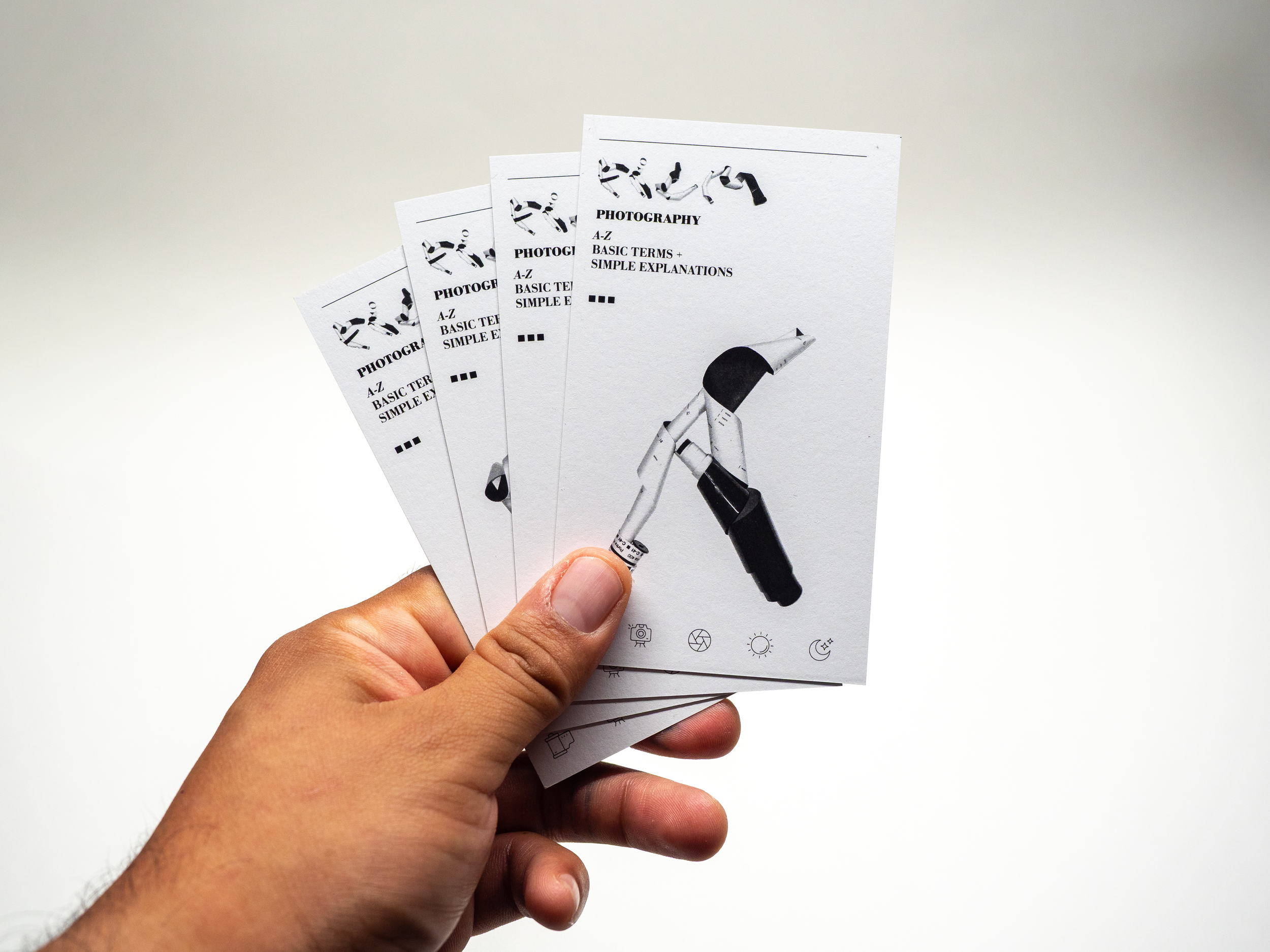
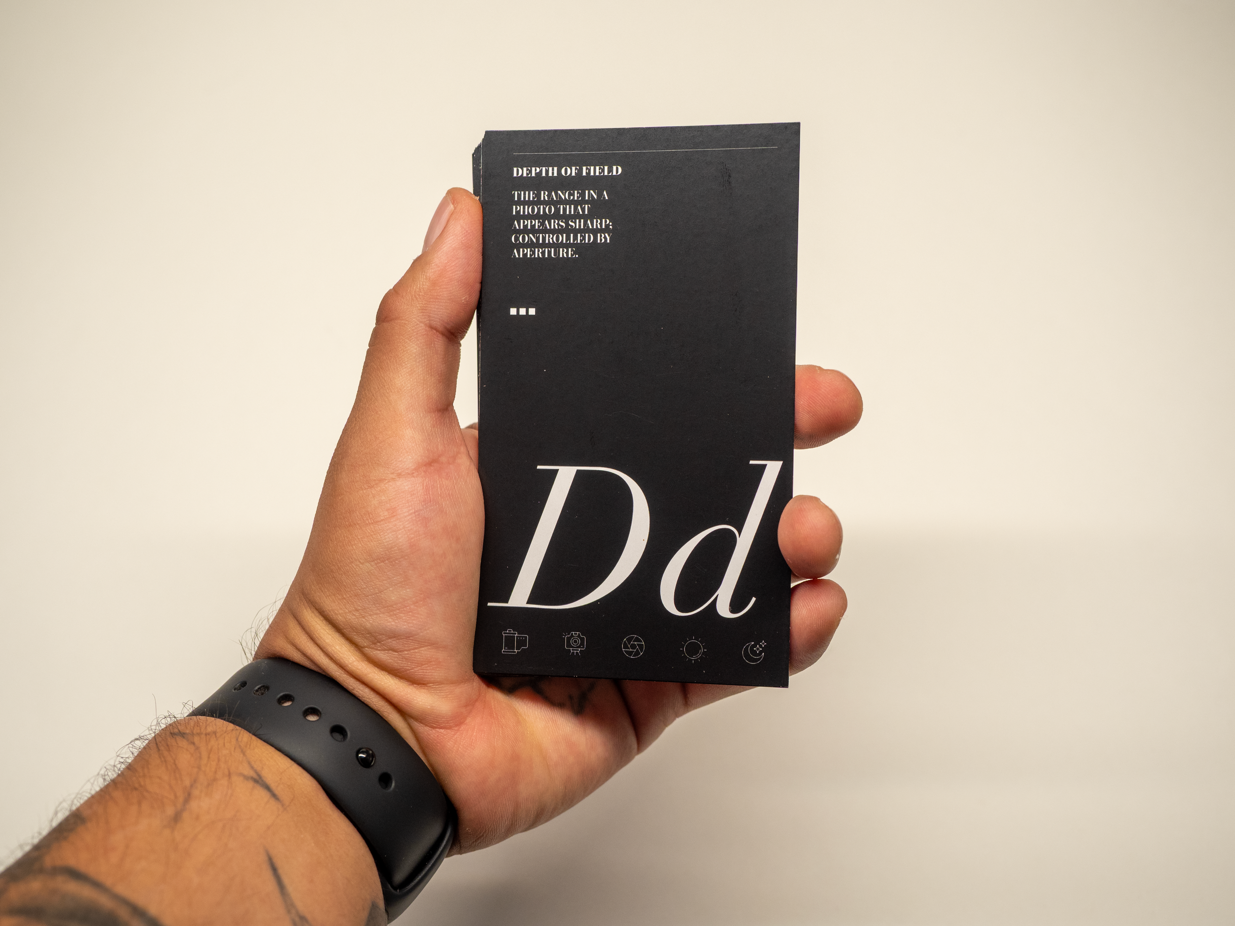
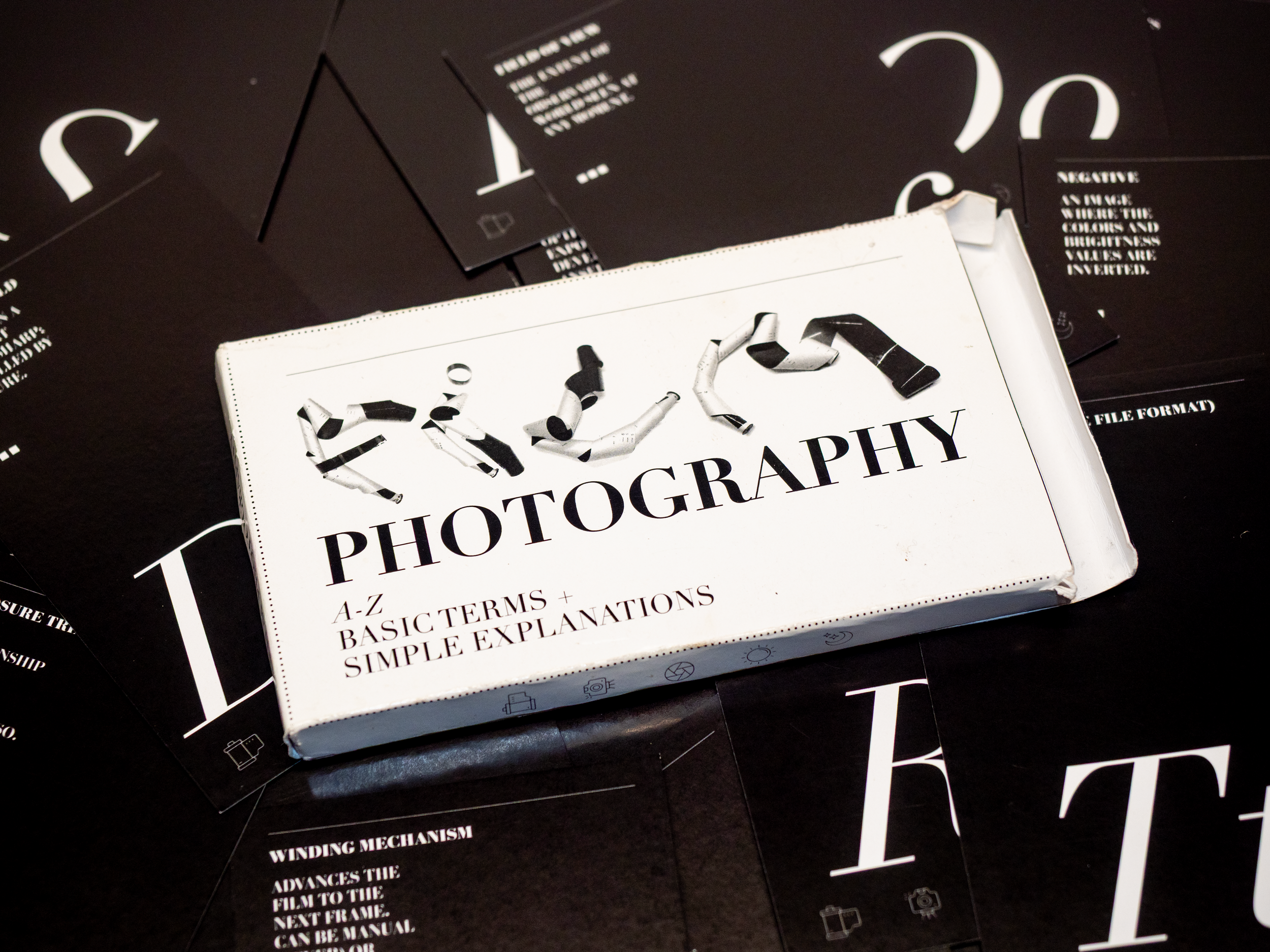
Dimensions: 2.75in x 4.75in Professional Card Stock.
Hierarchy: Front-facing experimental typography with technical definitions on the reverse.
Production: Custom glue-flap packaging designed for durability in the field.
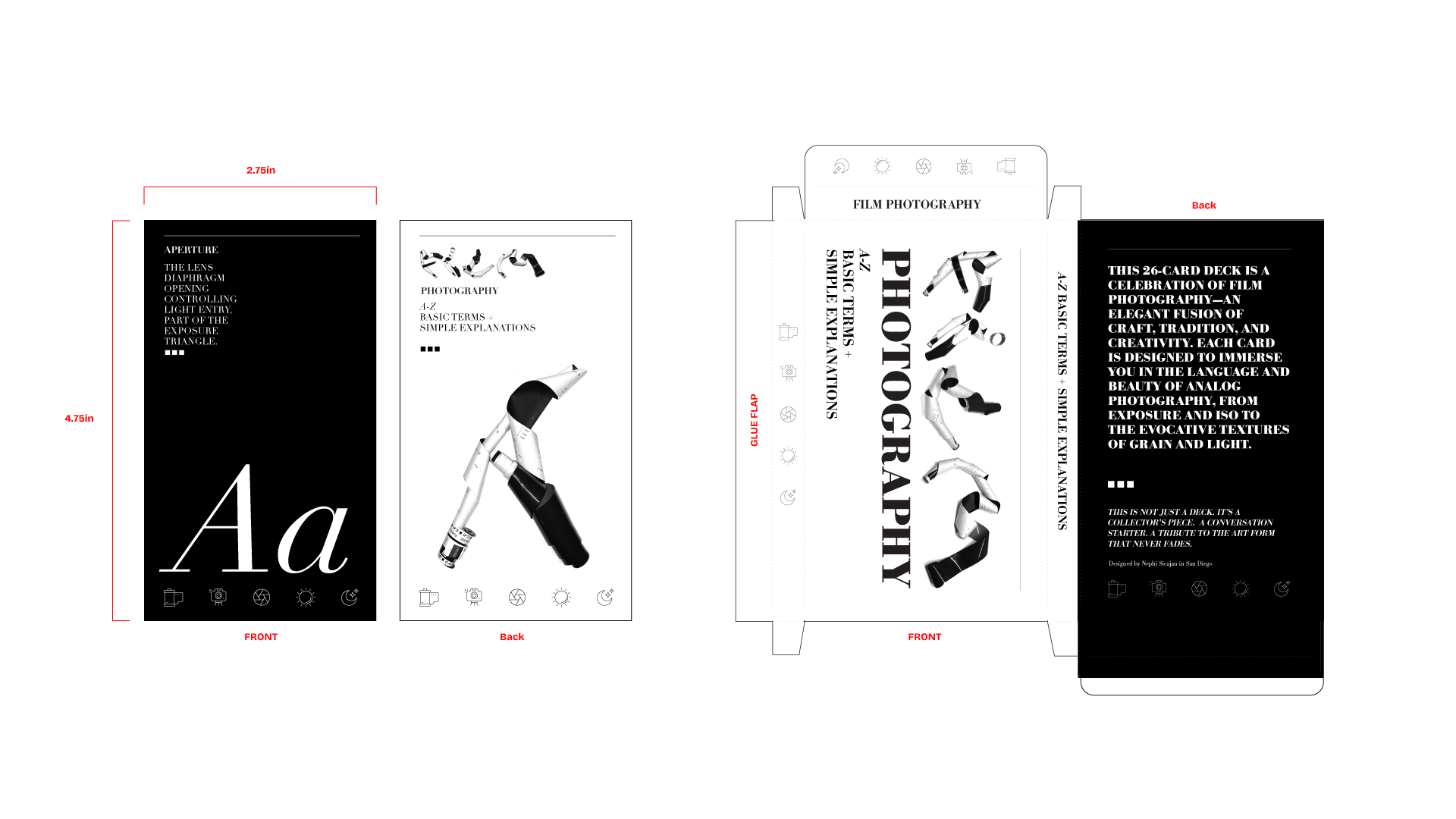
Custom iconography was developed to provide secondary visual cues for exposure settings.