VESTIGE
Type: Brand Identity & Experiential Design | Content Focus: Culture, Typography, Design, and Photography | Format: Systematic Publication / Print
Vestige is a multi-dimensional brand and editorial platform dedicated to the preservation and study of culture, design, typography, and photography. The project functions as both a systematic visual archive and a spatial intervention, bridging the gap between the printed page and the built environment.
Photography. Culture. Typography.
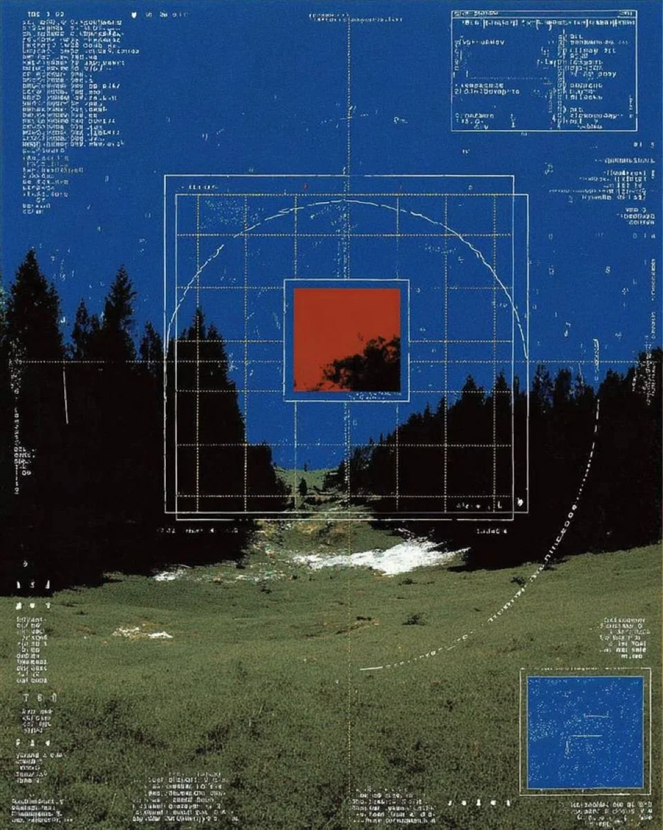
This project treats urban fragments as a framework rather than just visuals. Every bit of weathered signage or architectural remnant is a unit in a larger system, organized with precision and a high-contrast rhythm.
I used an Anti-Design methodology to keep the process "confessional." By leaving the raw technical markers visible, we’re bridging the space between field research and the printed page, offering a new way to decipher the social layers of our landscape.
Ideation
Design Approach
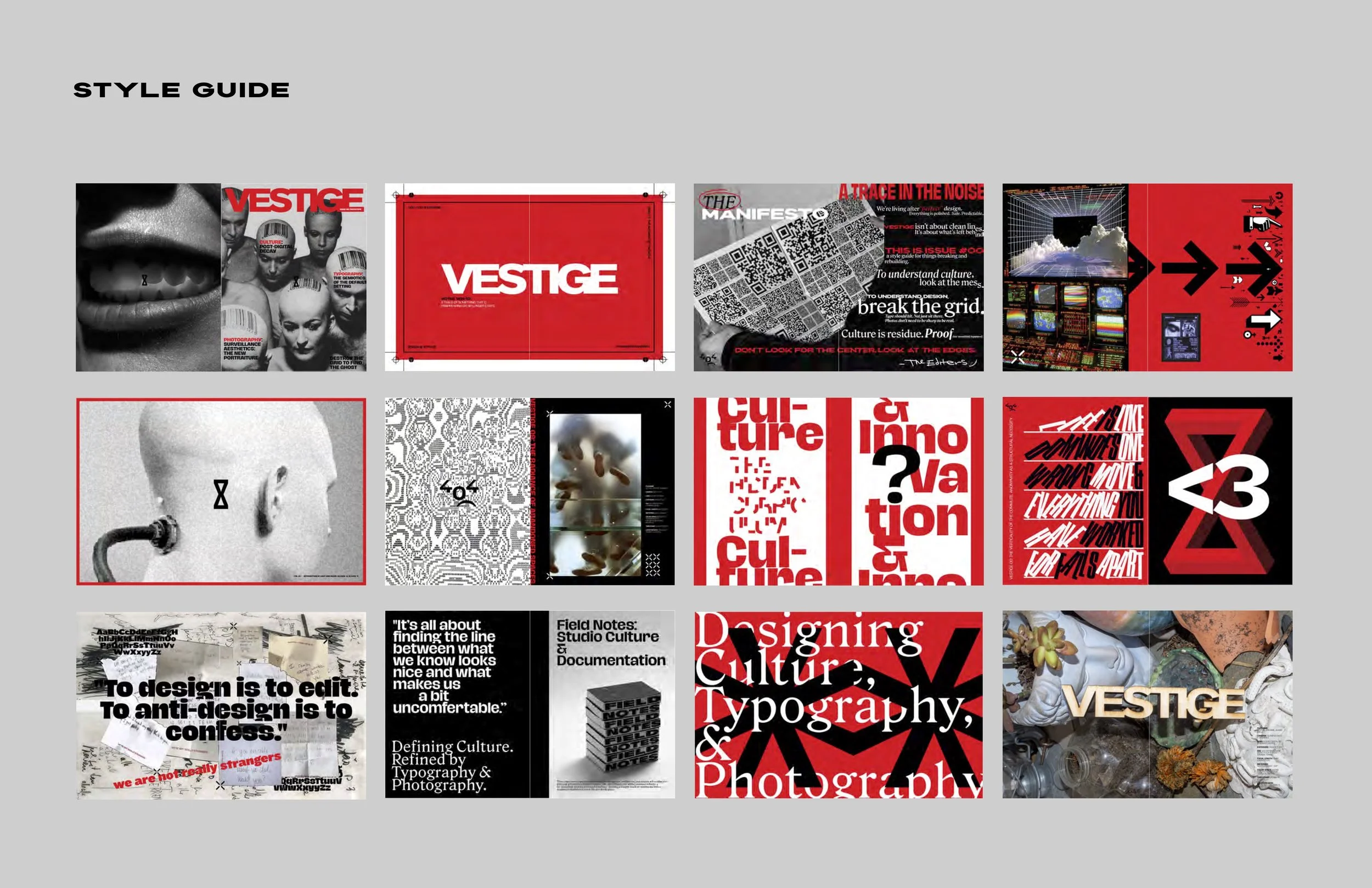
The visual language is rooted in anti-design logic, prioritizing raw, "confessional" aesthetics over conventional commercial polish.
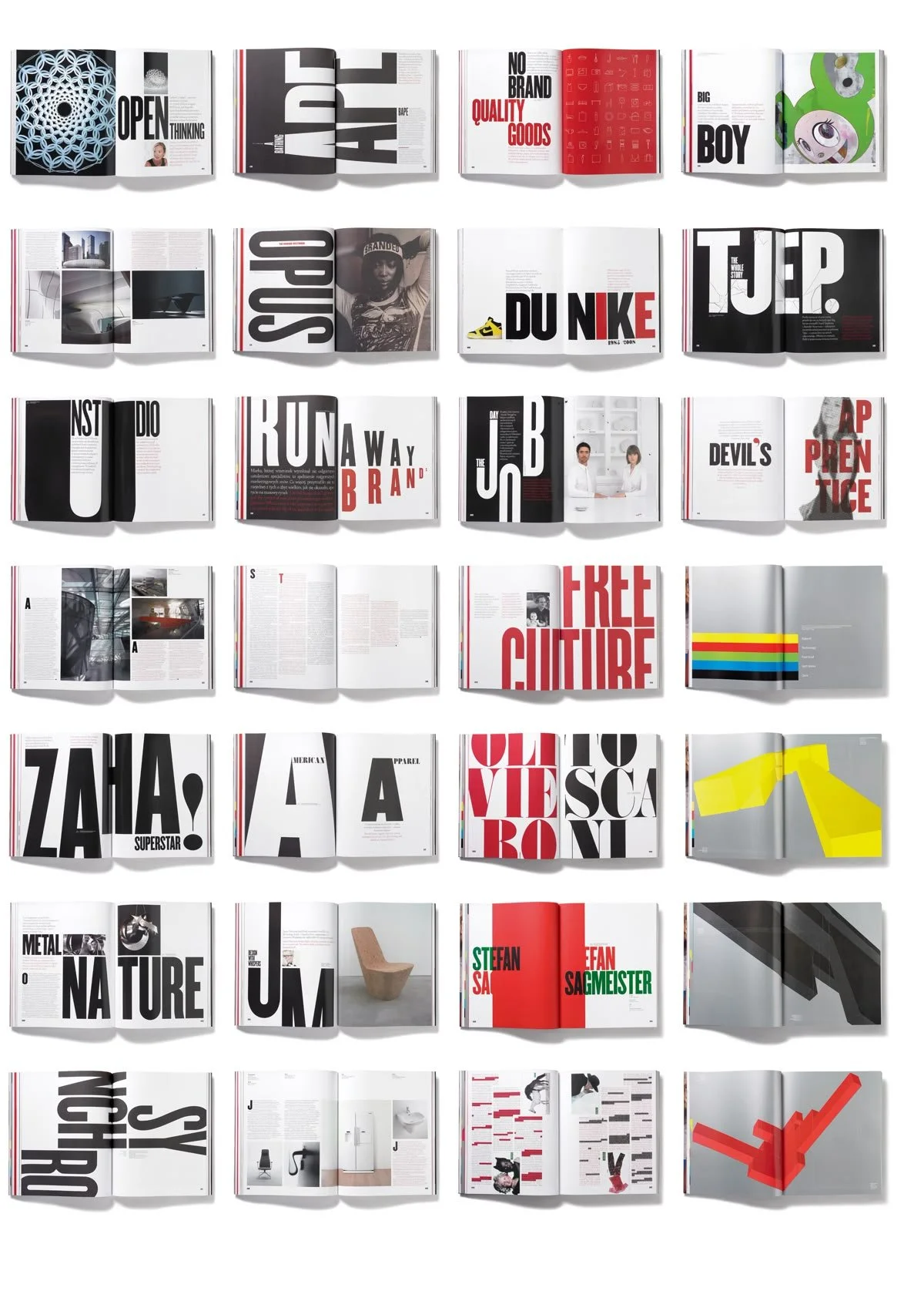
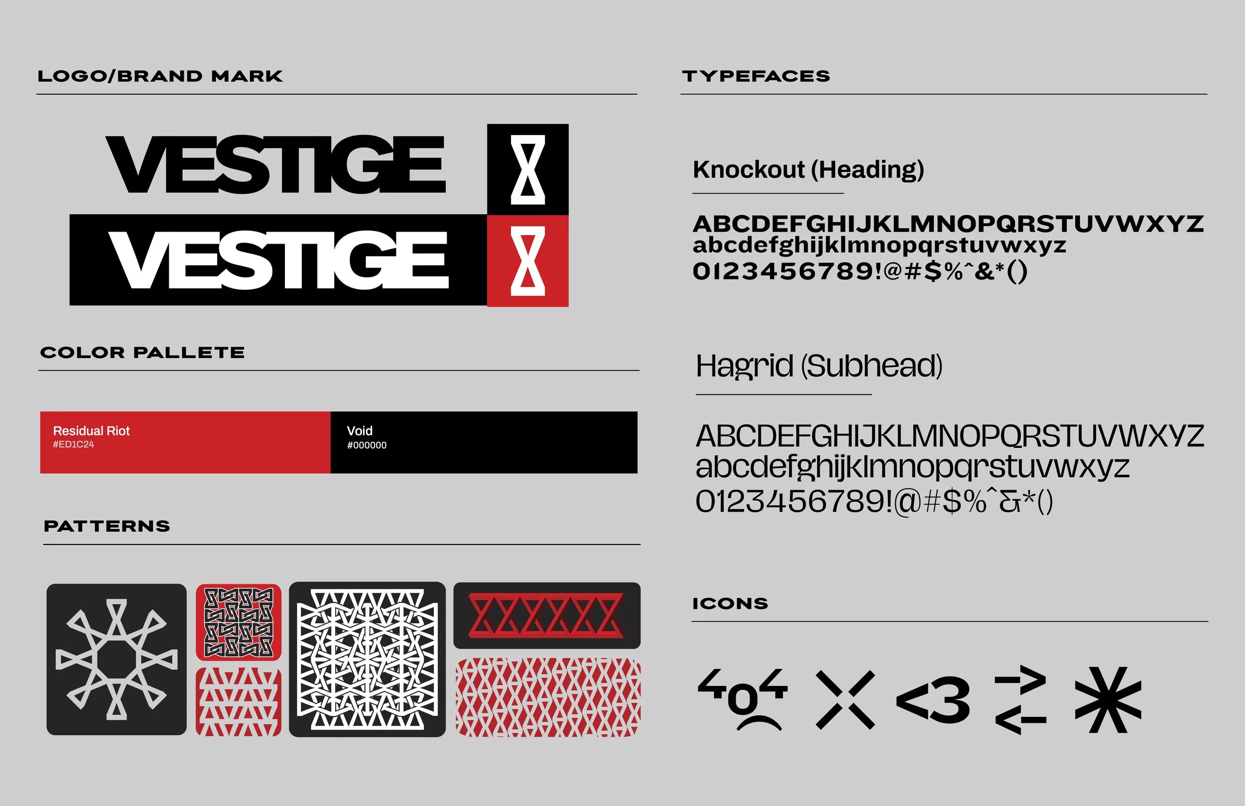
Systematic Branding: Utilizing a brutalist, modular framework to organize information alphabetically and categorically.
Materiality & Contrast: The use of high-contrast photography and unrefined typographic structures evokes a sense of urgency and historical weight, treating digital assets with the tactile grit of physical film.
Spatial Integration :Designing for the environment rather than the screen, the approach relies on verticality and architectural constraints to create a sense of presence.
Objective
The primary goal of Vestige was to create a cohesive brand ecosystem that archives the "remnants" of culture and specialized craft. By reinterpreting technical and historical vocabularies—specifically the nuanced language of film photography—the project aims to lower the barrier to entry for complex design disciplines. The ultimate objective was to demonstrate how a brand can transition from a static editorial format into a modular, experiential environment.
Process
The development of the brand followed a rigorous research and documentation-led workflow:
Field Documentation: Conducting site-specific research and high-contrast photography to identify artifacts of vernacular lettering and architectural decay.
Archival Mapping: Categorizing found textures and technical terms (e.g., aperture, grain, reciprocity) into a structured visual database.
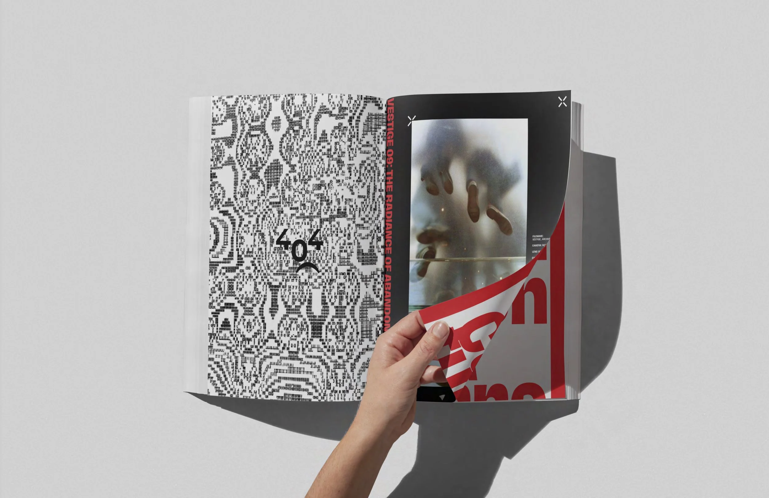
Editorial Construction: Translating field data into a publication format that balances technical clarity with experimental layout.
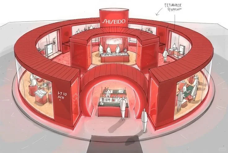
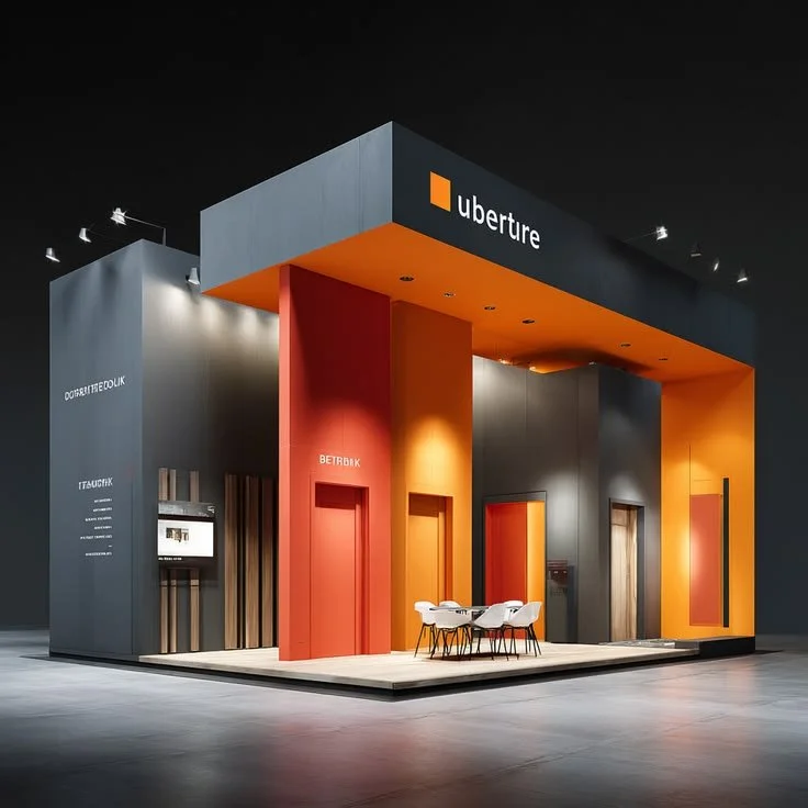
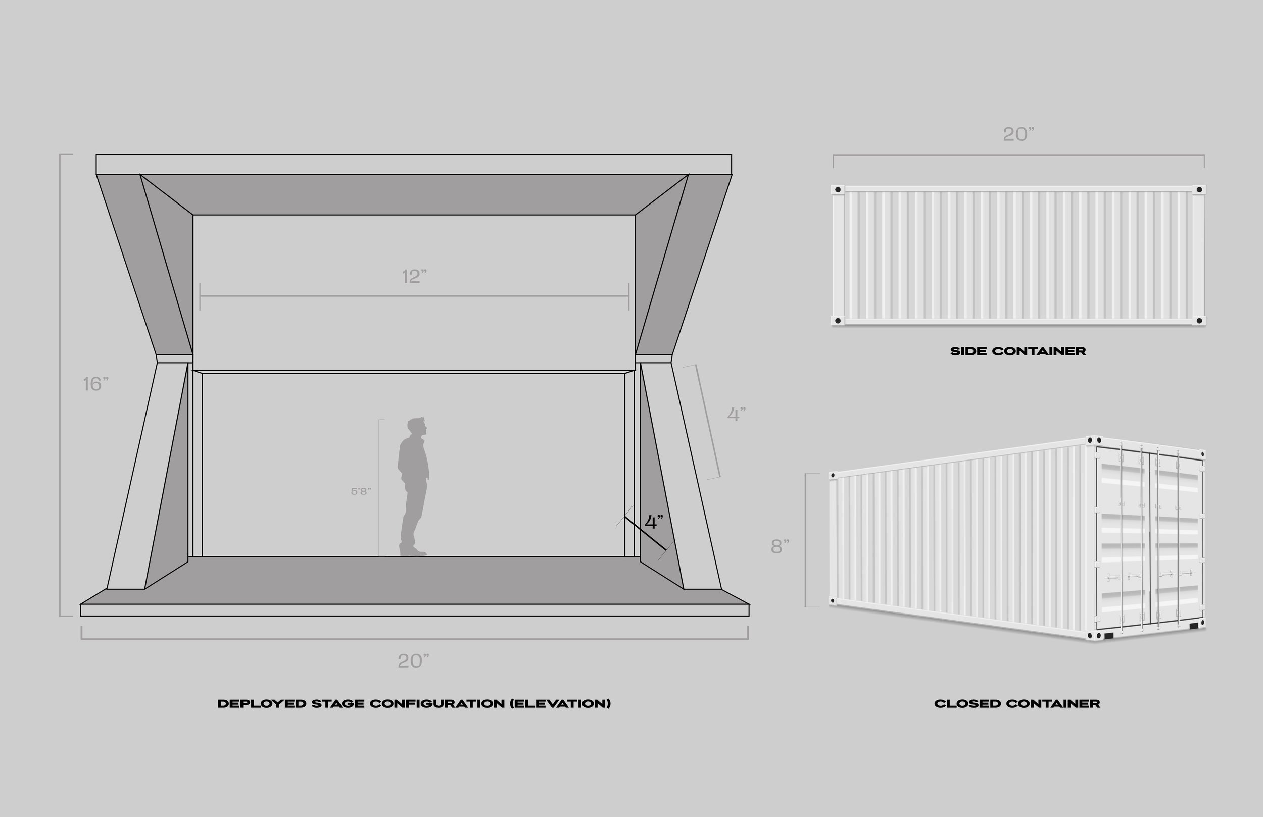
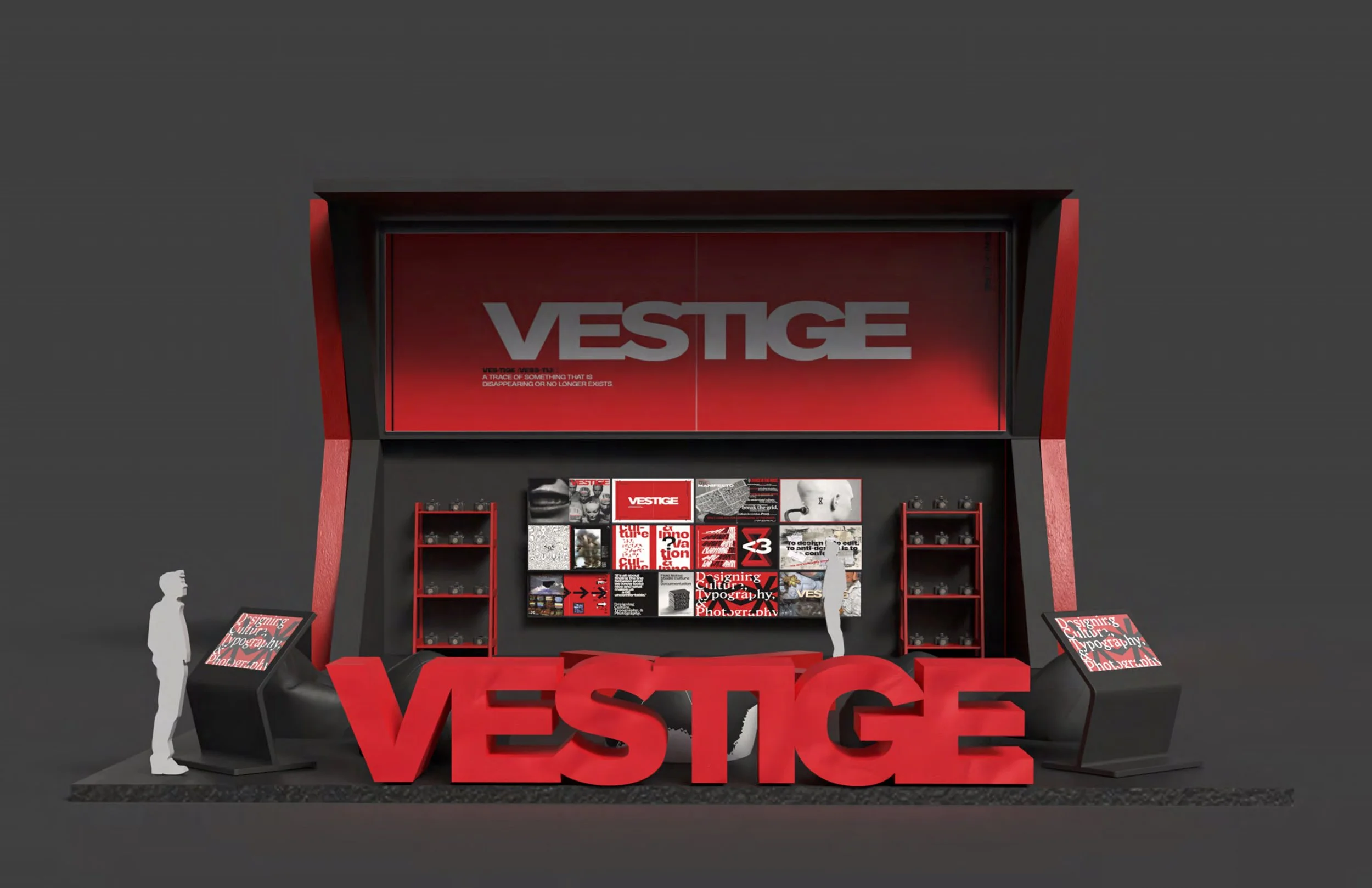
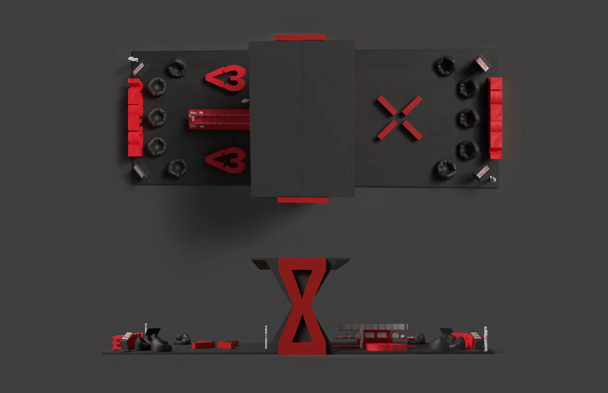
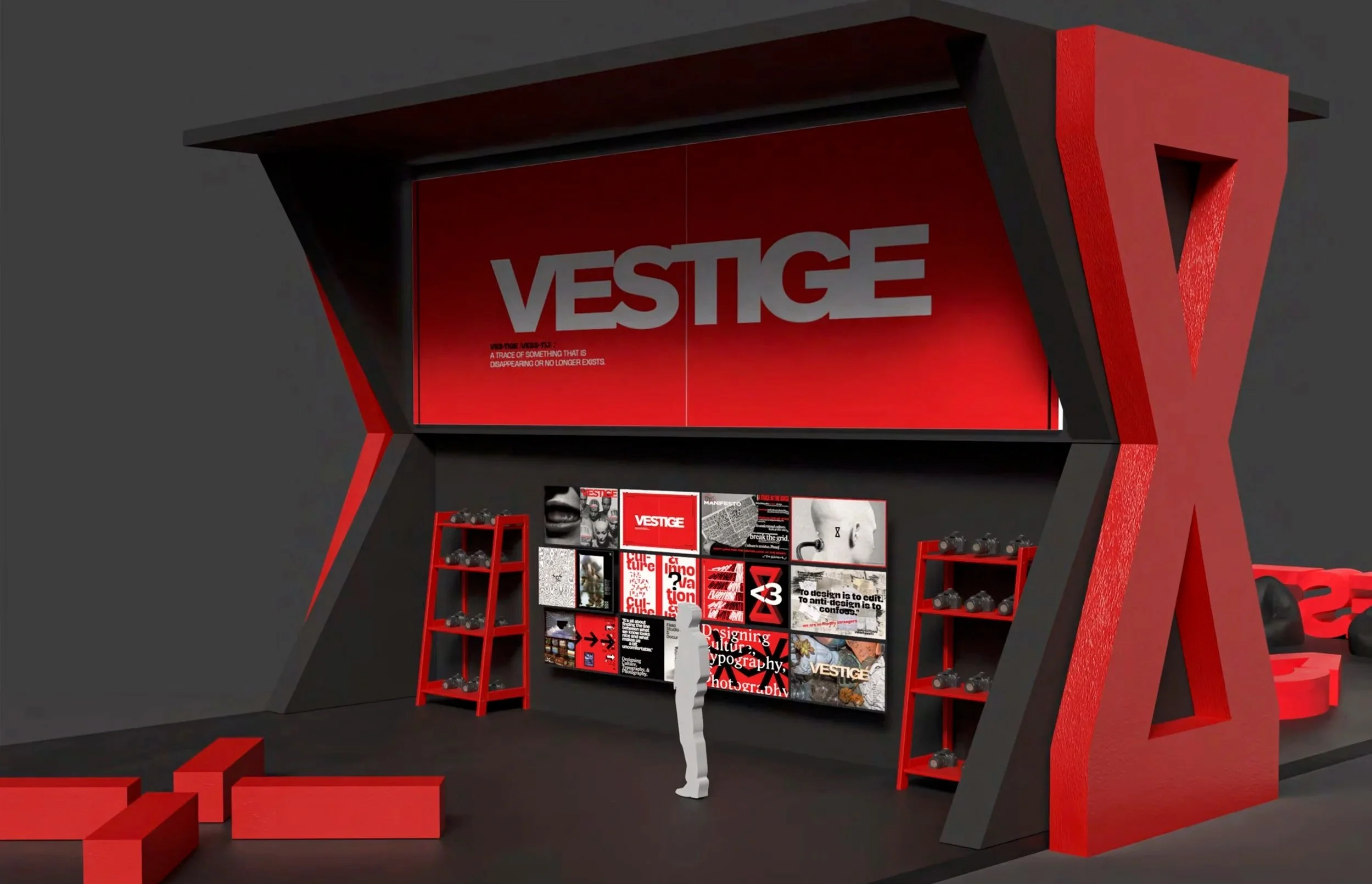
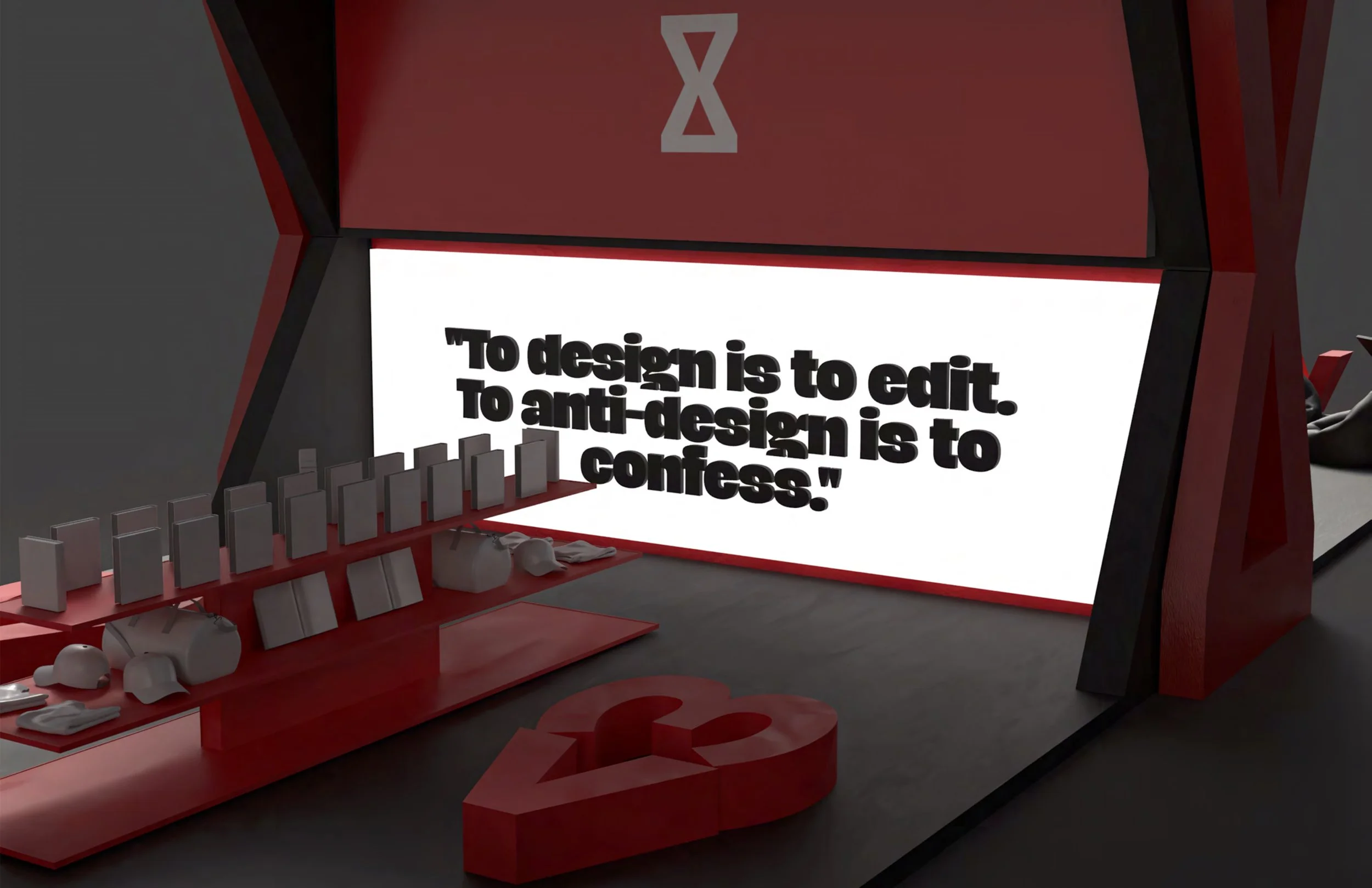
Environmental Prototyping: Developing kiosk elevations and site plans to visualize how the brand occupies physical space, from trade show floors to independent urban environments.
Siteplan
Experiential & Spatial Design
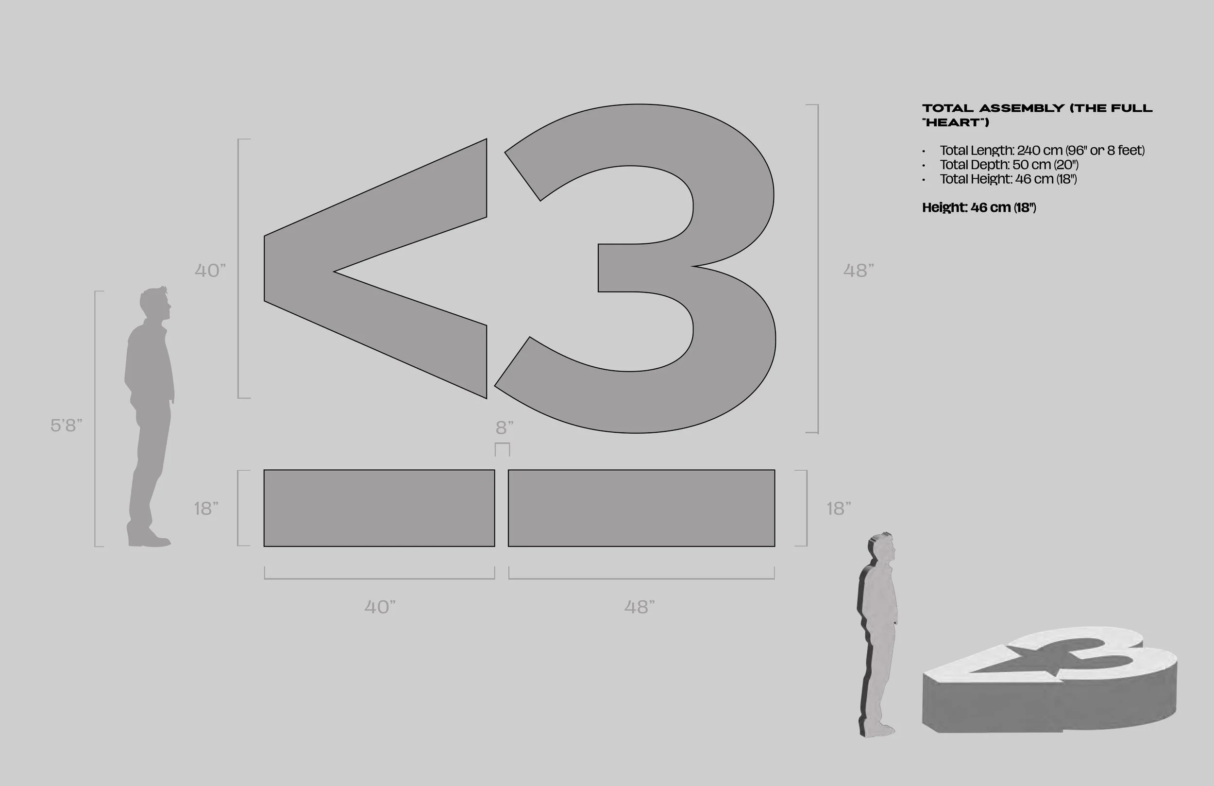
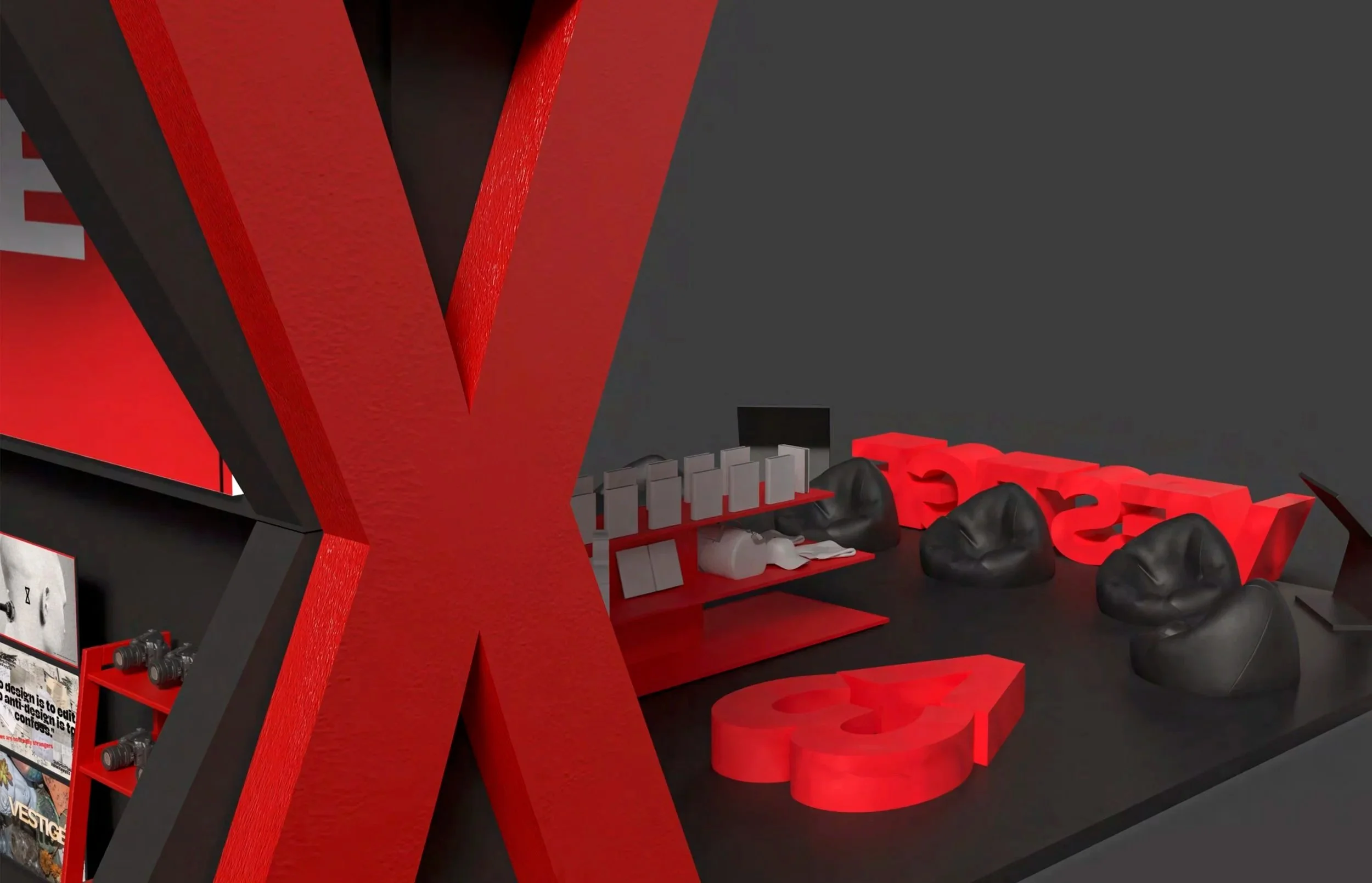
The project transitions from the page to the environment through kiosk elevations and site-specific interventions. These structures are designed to be deployed in various public and commercial spaces, serving as "physical archives" for the brand.
Kiosk Structures: Modular, industrial-style elevations designed for:
Trade Shows: As high-impact brand showcases.
Malls & Retail: Providing a tactile, interactive touchpoint for the magazine.
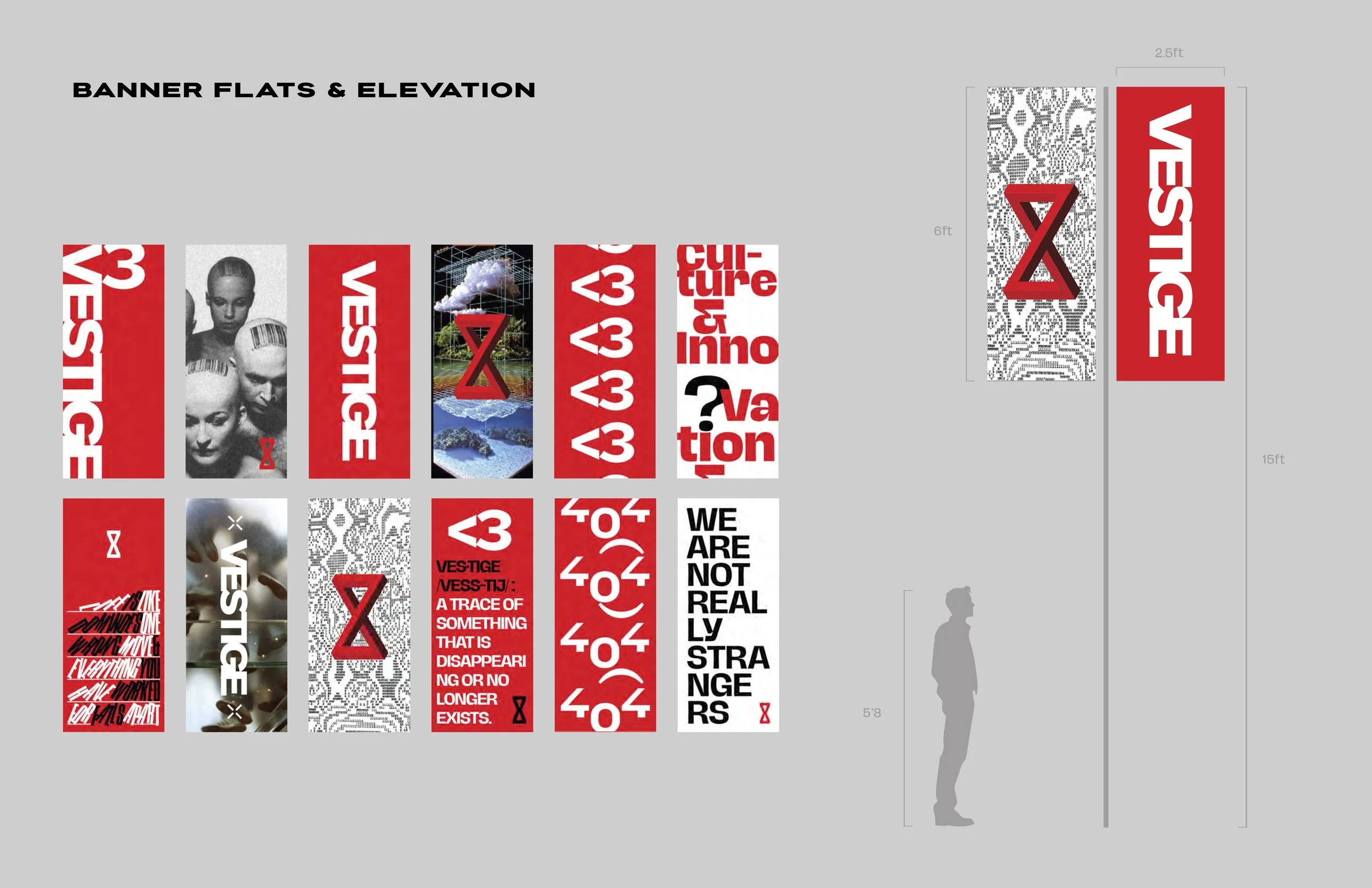
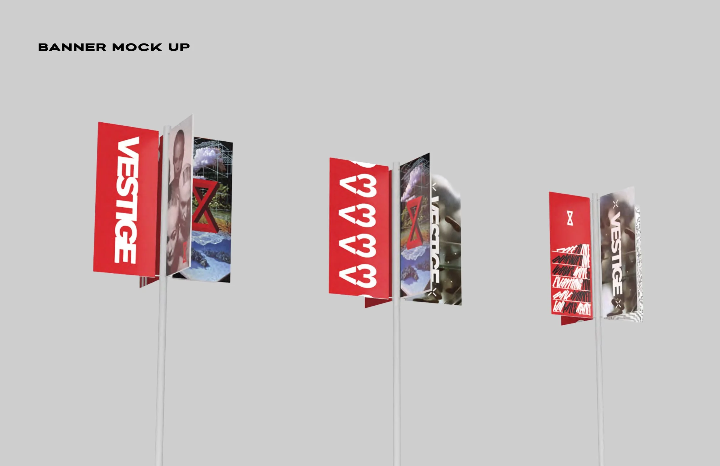
Outdoor Indie Environments: Utilizing brutalist materials and vertical banner flats that harmonize with urban decay and architectural environments.
Site Plans: The project includes detailed site plans and vertical banners that act as spatial interventions, turning a physical location into a curated brand experience.
Outcome
The final result is a comprehensive identity system that functions as a "living archive."
The Publication: A magazine that serves as the brand's core narrative engine.
Experiential Kiosks: A series of modular elevations and vertical banner flats designed for deployment in malls, trade shows, and outdoor spaces.
Visual Narrative: A robust, adaptable branding kit that maintains a consistent, gritty, and historically informed tone across both print and spatial applications.