
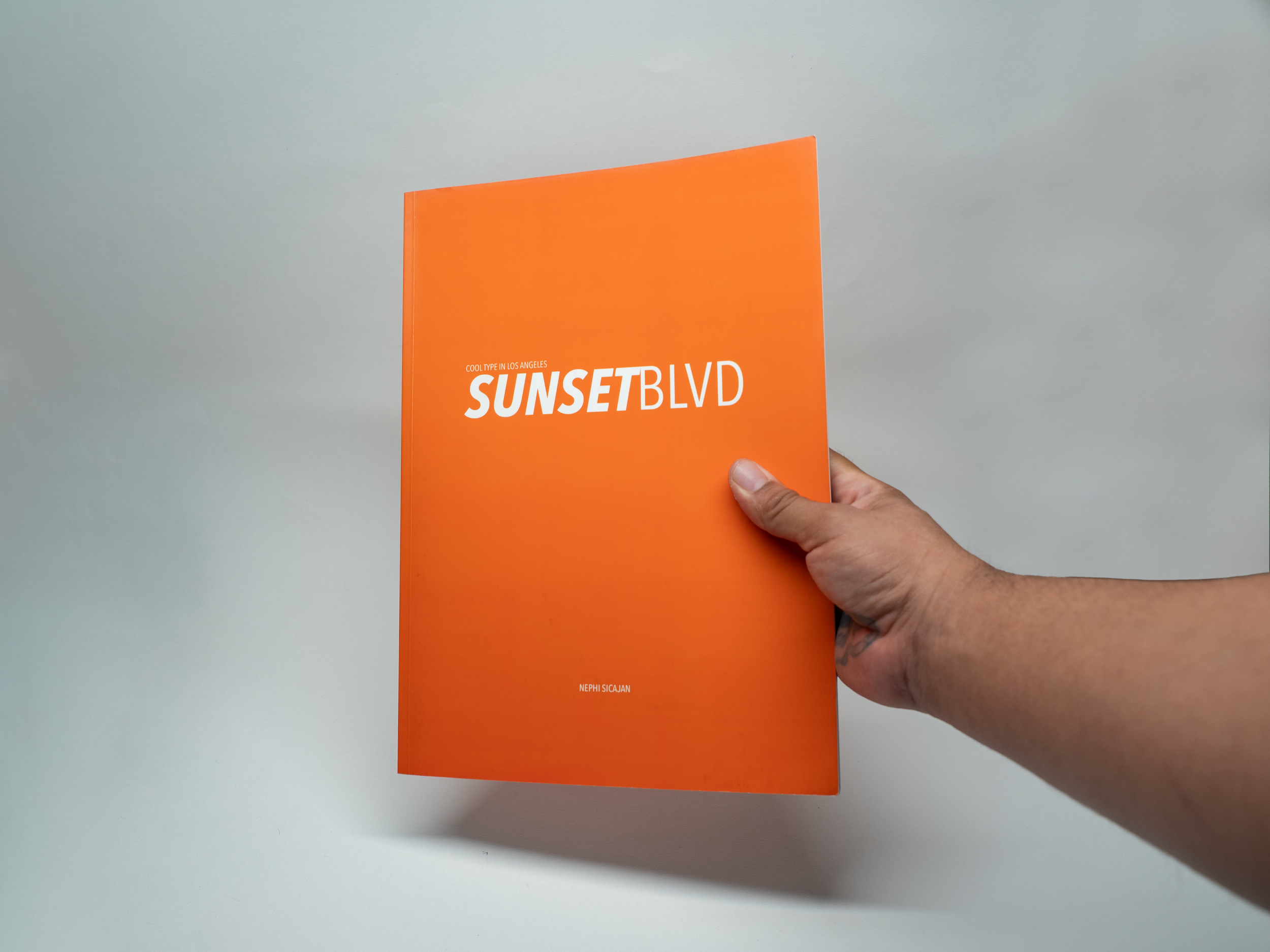
Sunset Blvd: Cool Type In Los Angeles
Sunset BLVD is a systematic exploration of the typographic landscape of Los Angeles. By blending editorial design with environmental photography, the project serves as both a visual archive and a brand study of the city's iconic vernacular.
Role: Creative Direction, Brand Identity, Editorial Design, Typography, and Production
Deliverables: Cover Design, Typography System, Layout & Grid System, Print Production
Tools: Adobe InDesign • Photoshop • Illustrator
Now part of the Letterform Archive's permanent collection, praised as a study capturing LA's street lettering before it fades.
Ideation
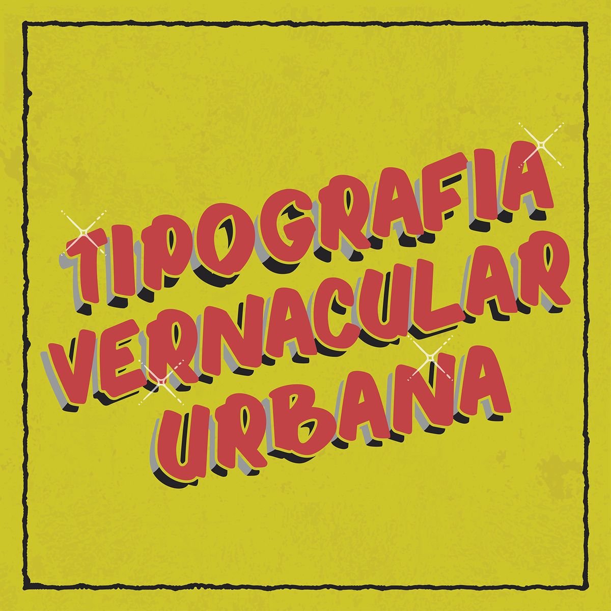
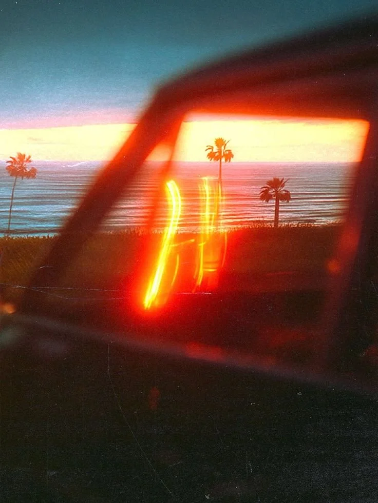
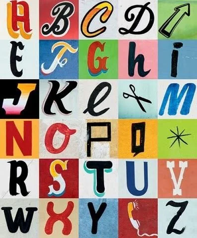
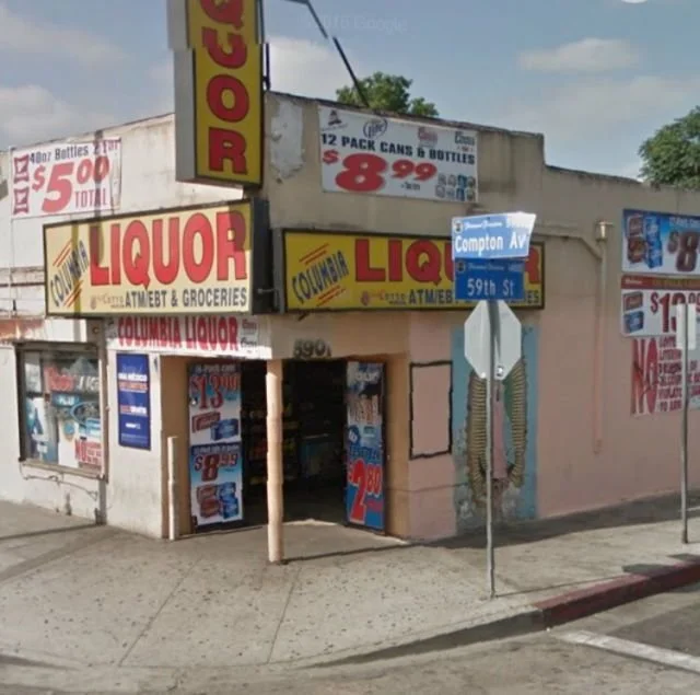
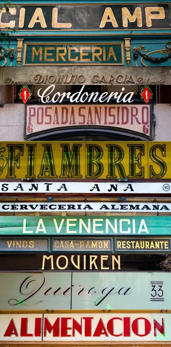
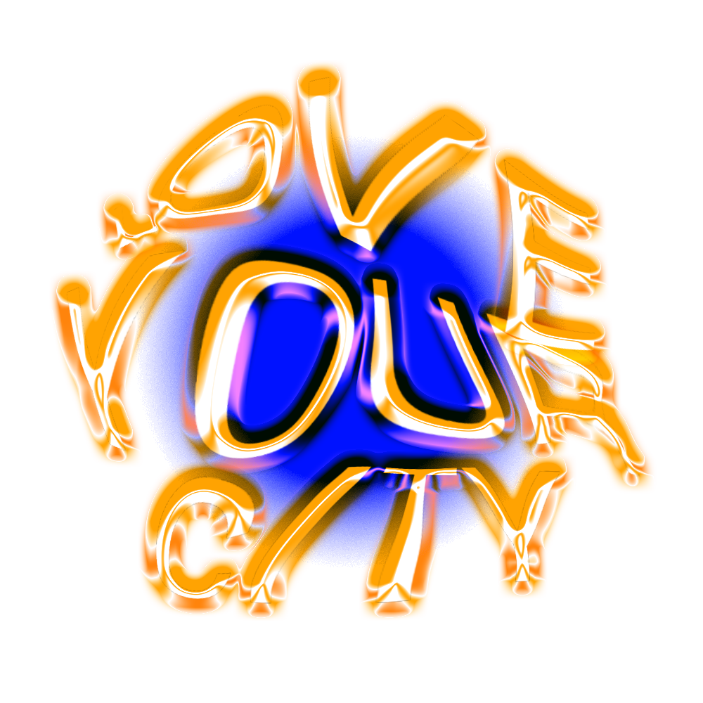
I’m a designer who explores the intersection of typography, culture, and place.
Through projects like my Sunset Blvd Typography Book, I document and celebrate the visual language of neighborhoods, revealing how type reflects local identity and tells compelling, place-based stories.
-
The layout was designed to balance storytelling with visual clarity through a flexible grid system that maintained consistency while allowing variation across the spreads. White space was used intentionally to give images and typography room to breathe, while scale, weight, and placement established a clear visual hierarchy.
To emphasize the relationship between typography and photography, type was integrated within and around the imagery, creating moments of visual tension. Full-bleed photographs alternate with minimal layouts to establish rhythm, while pull quotes and detail shots provide visual anchors. The result is a composition that reflects the layered, expressive character of Sunset Blvd.
-
On the streets of Sunset Blvd, it reflects the voices of local businesses, the cultural richness of the neighborhood, and the evolution of style over time. In my work, I use typography as a lens to explore identity, history, and place.
-
In projects like the Sunset Blvd Typography Book, I use photography to document the visual language of neighborhoods — preserving the character of hand-painted signs, vintage lettering, and the street-level stories told through type.
-
This project explores how typography becomes a reflection of community identity, heritage, and creative expression along Sunset Blvd. Each letterform, color, and style tells a story — revealing the cultural layers that define one of Los Angeles' most vibrant and diverse neighborhoods.
-
In the Sunset Blvd Typography Book, print design is central to the storytelling. Every detail, from layout and type to paper choice and pacing, was carefully considered to reflect the street's visual richness. The result is a physical artifact that honors the culture, craft, and layered history of Sunset Blvd.
Page Through
What started as street photography became design history — SunsetBLVD now lives in the Letterform Archive's permanent collection.