6 step branding brochure
A clean, intentional piece designed to simplify the complex.
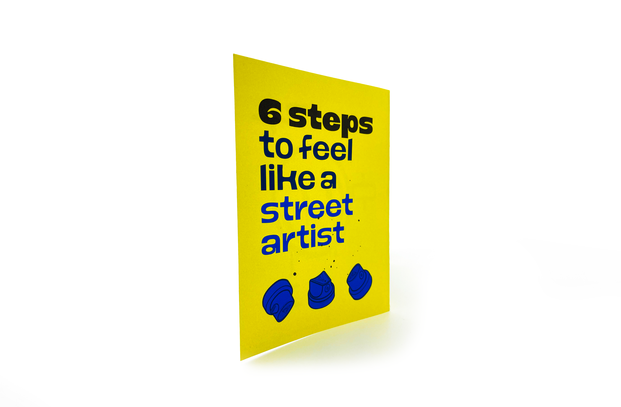
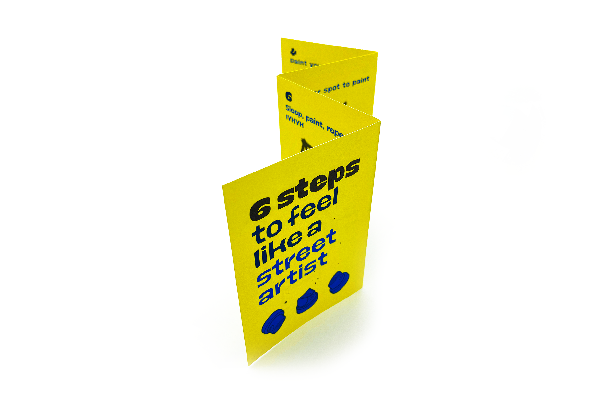
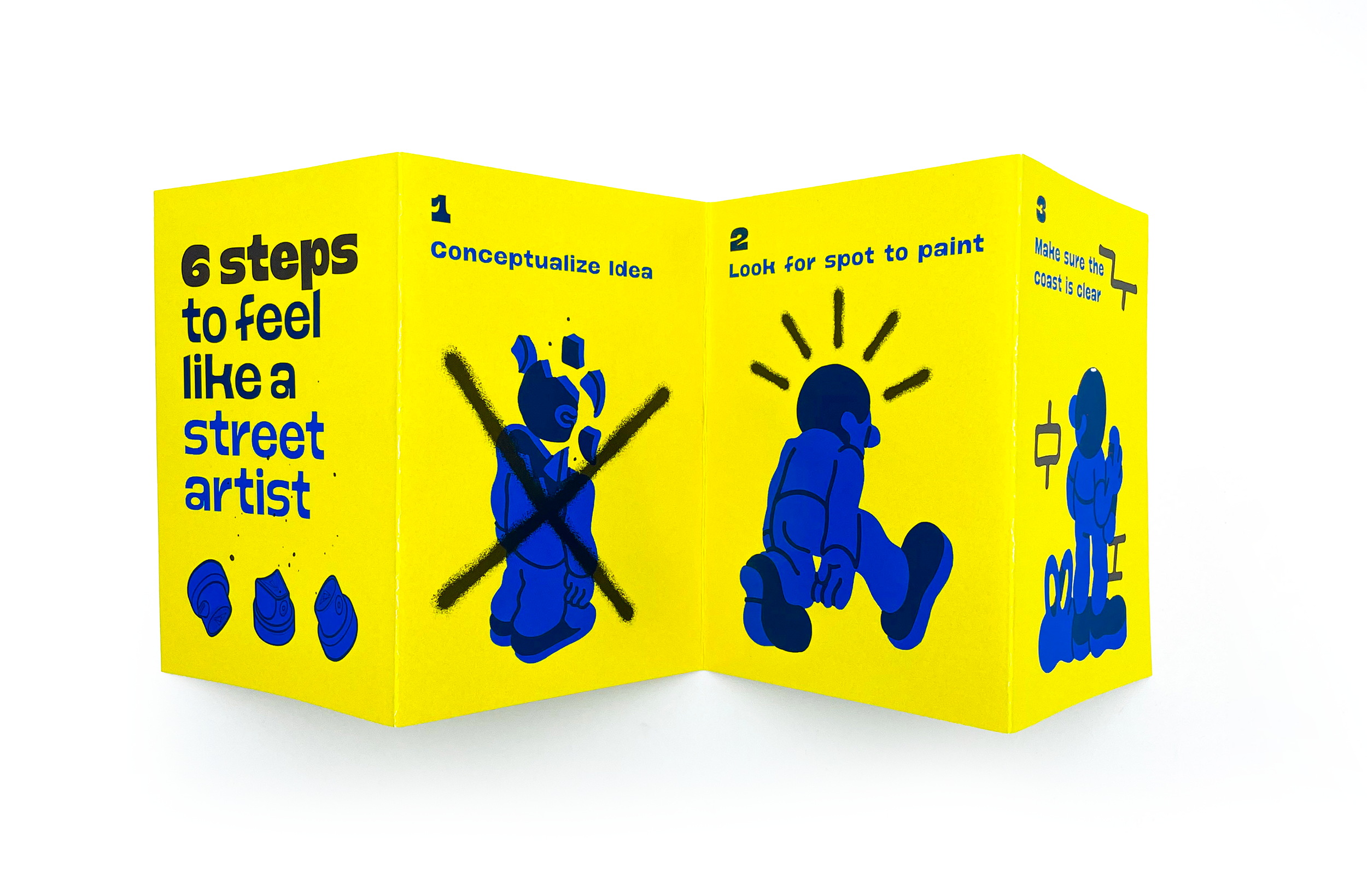
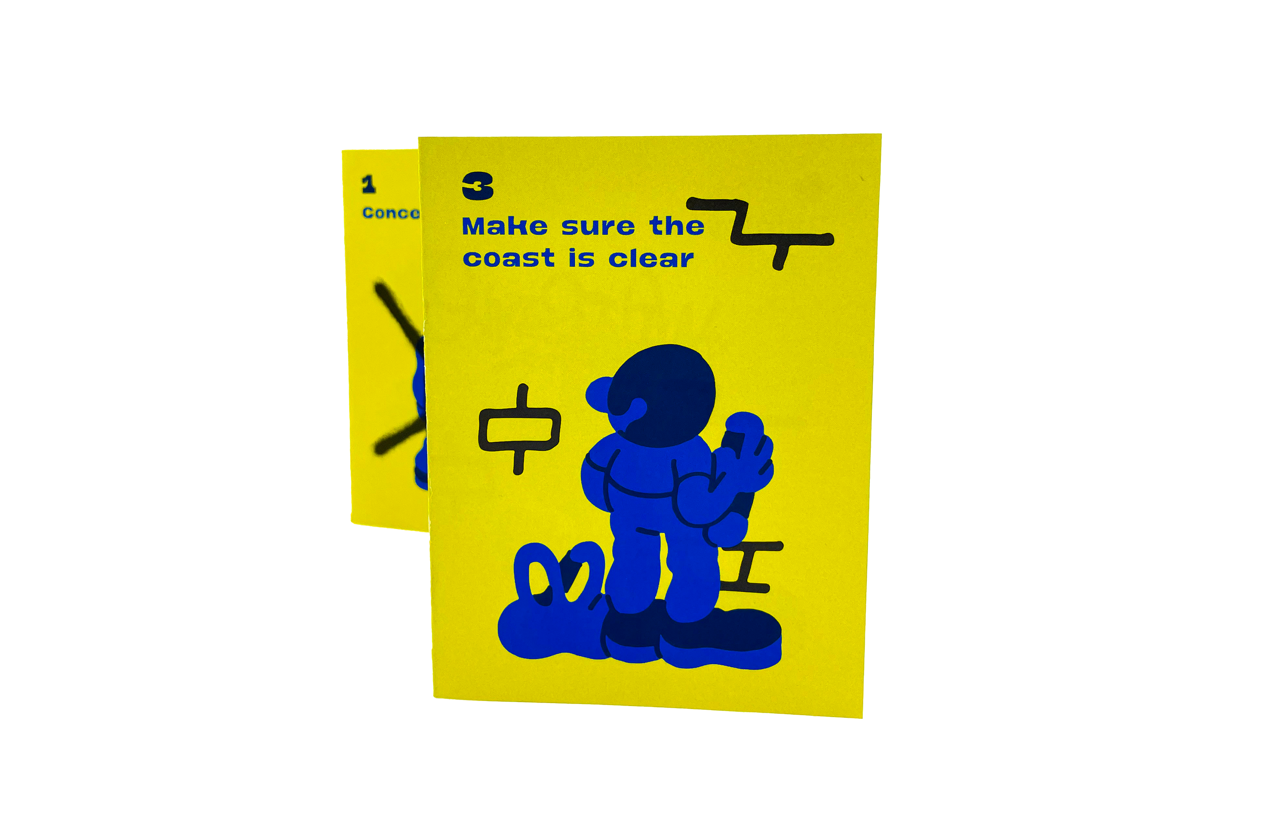
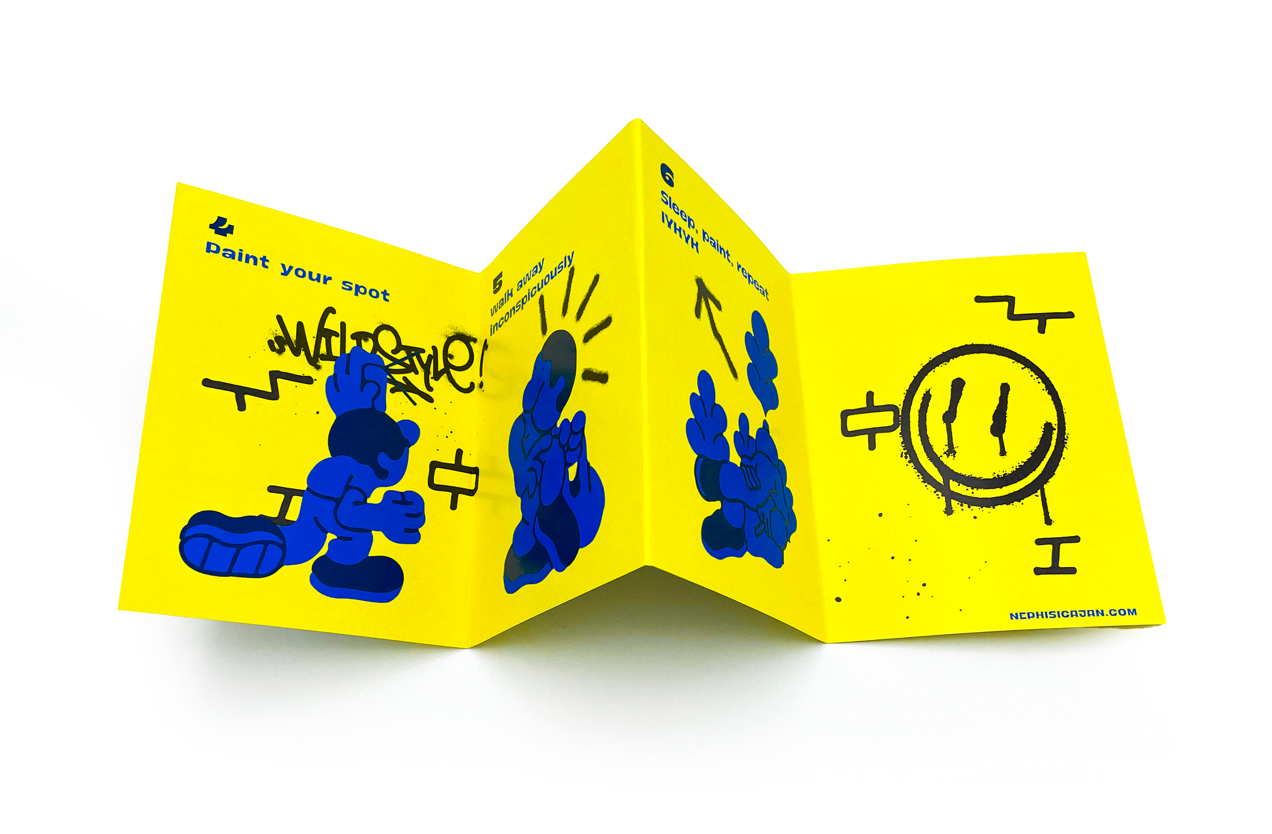
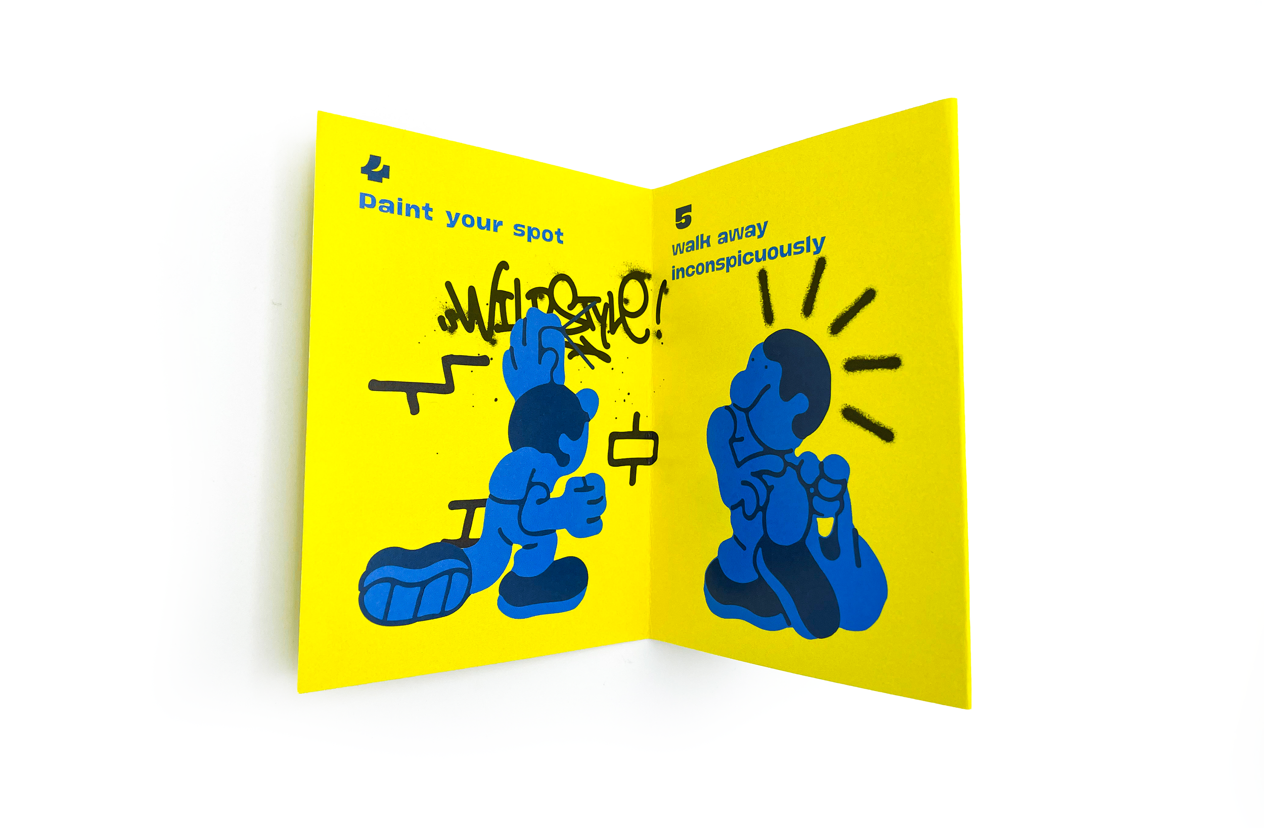
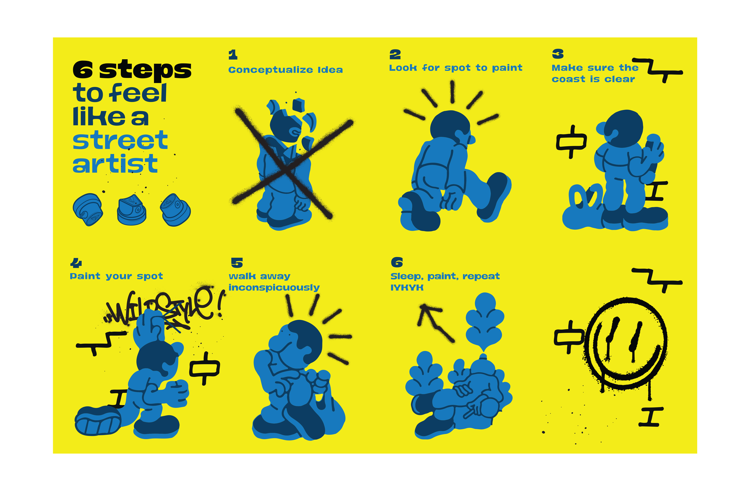
This brochure walks clients through the brand-building journey in just six thoughtful steps. Minimal design meets clear strategy: each page balances white space, typography, and structure to guide the reader effortlessly from insight to identity. It's not just a brochure, it's a brand experience in print.

I design experiences that turn passive observation into active participation, empowering you to step into the creative spirit of the streets and leave your own mark.
A clean, intentional piece designed to simplify the complex.
This brochure walks clients through the brand-building journey in just six thoughtful steps. Minimal design meets clear strategy: each page balances white space, typography, and structure to guide the reader effortlessly from insight to identity. It's not just a brochure, it's a brand experience in print.
-
Adobe Illustrator – for vector graphics, icons, and layout precision
Adobe Photoshop – for image editing and texture creation
Digital Camera – for taking pictures of my brochure to make a clear visual mock-up
-
The heart of the project.
Rooted in the raw energy of street culture, the concept explores how anyone can tap into the mindset of a street artist — bold, expressive, and unfiltered. It sets the tone for every design decision, shaping the visual language, tone, and experience from start to finish. -
Bold. Gritty. Unfiltered.
This brand strategy channels the raw spirit of street art — built on authenticity, rebellion, and creative freedom. From its visual language to its tone of voice, every element is designed to feel spontaneous yet deliberate, echoing the DIY mindset and fearless expression of artists who claim the streets as their canvas. -
Structured chaos with purpose.
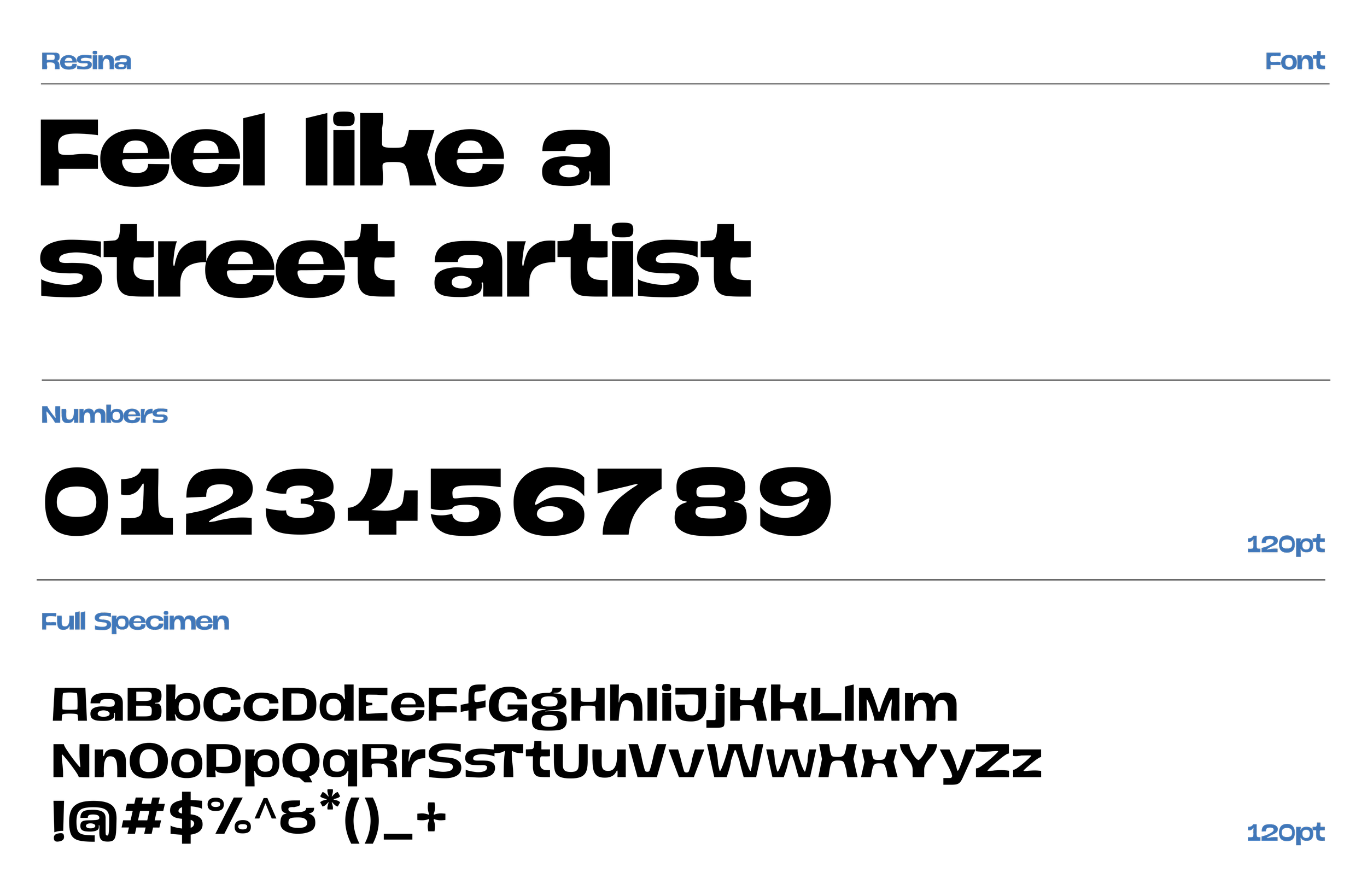
The layout blends clean grids with unexpected breaks — mirroring the energy of street art in an editorial form. Bold headlines, layered imagery, and deliberate white space guide the flow while keeping the raw, expressive tone intact. Every page is designed to feel spontaneous yet intentional. -
Designed for impact, prepared for production.
Final layouts were optimized for print with precise margins, bleed settings, and color profiles. Every element — from textures to typography — was carefully aligned and packaged to ensure the raw energy of the design translated seamlessly from screen to paper.
Artwork by MURETZ